
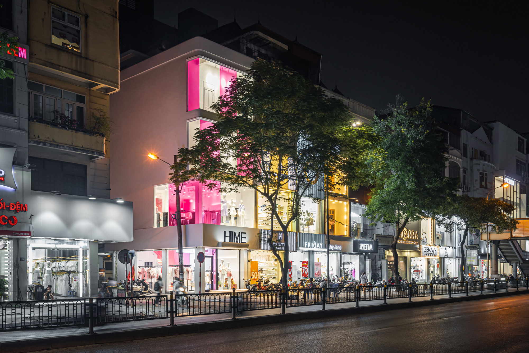
Hime
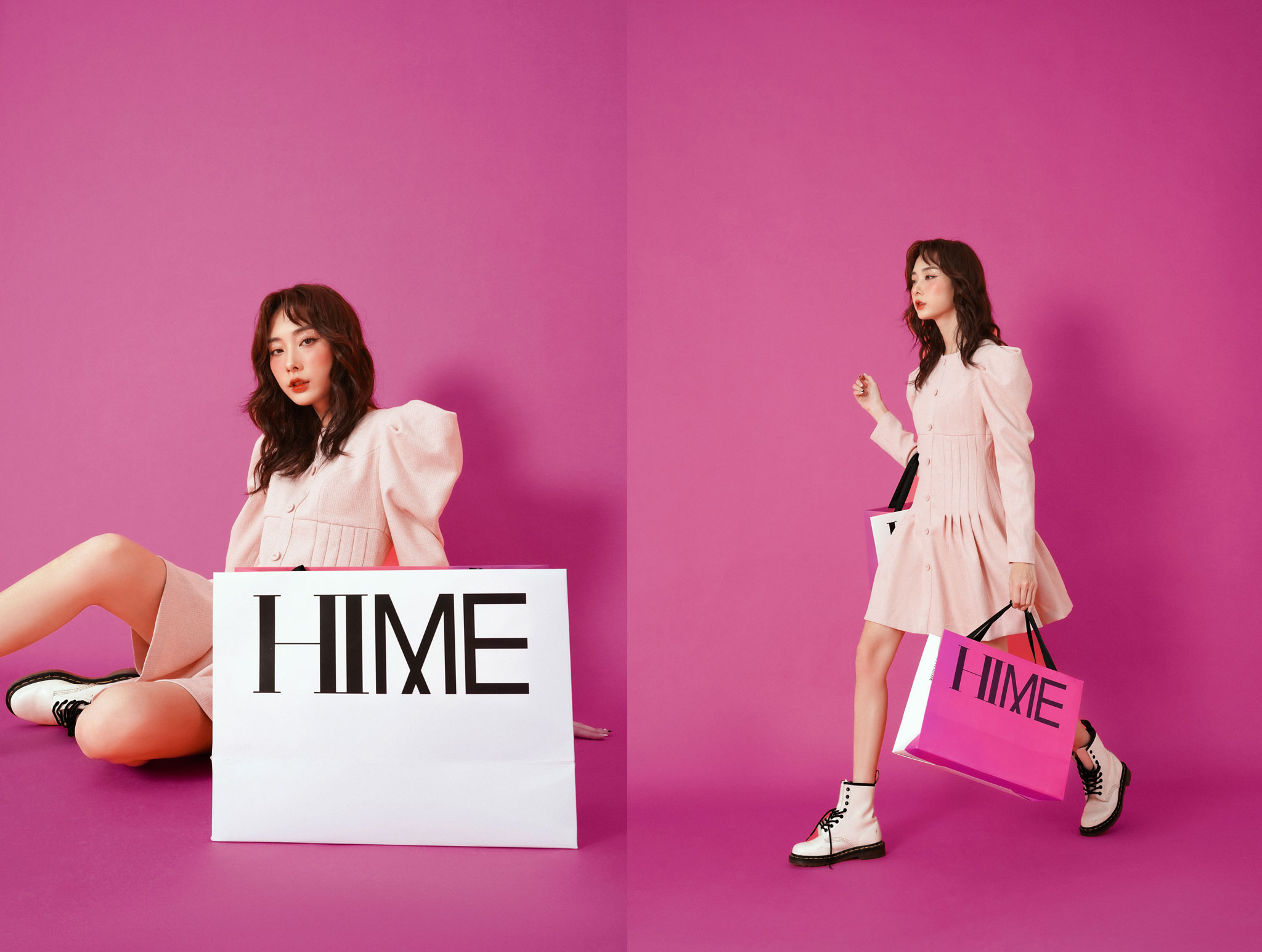
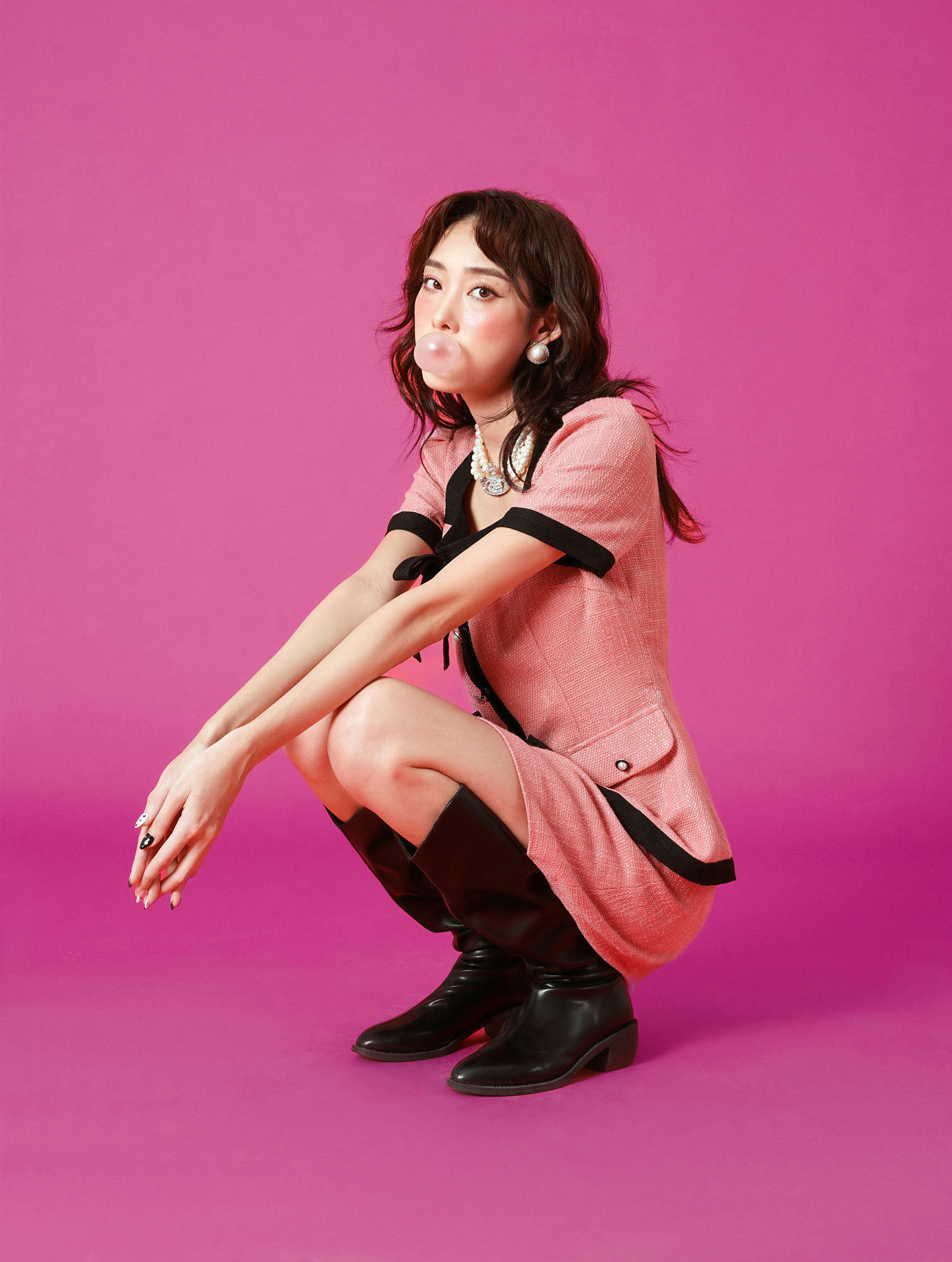
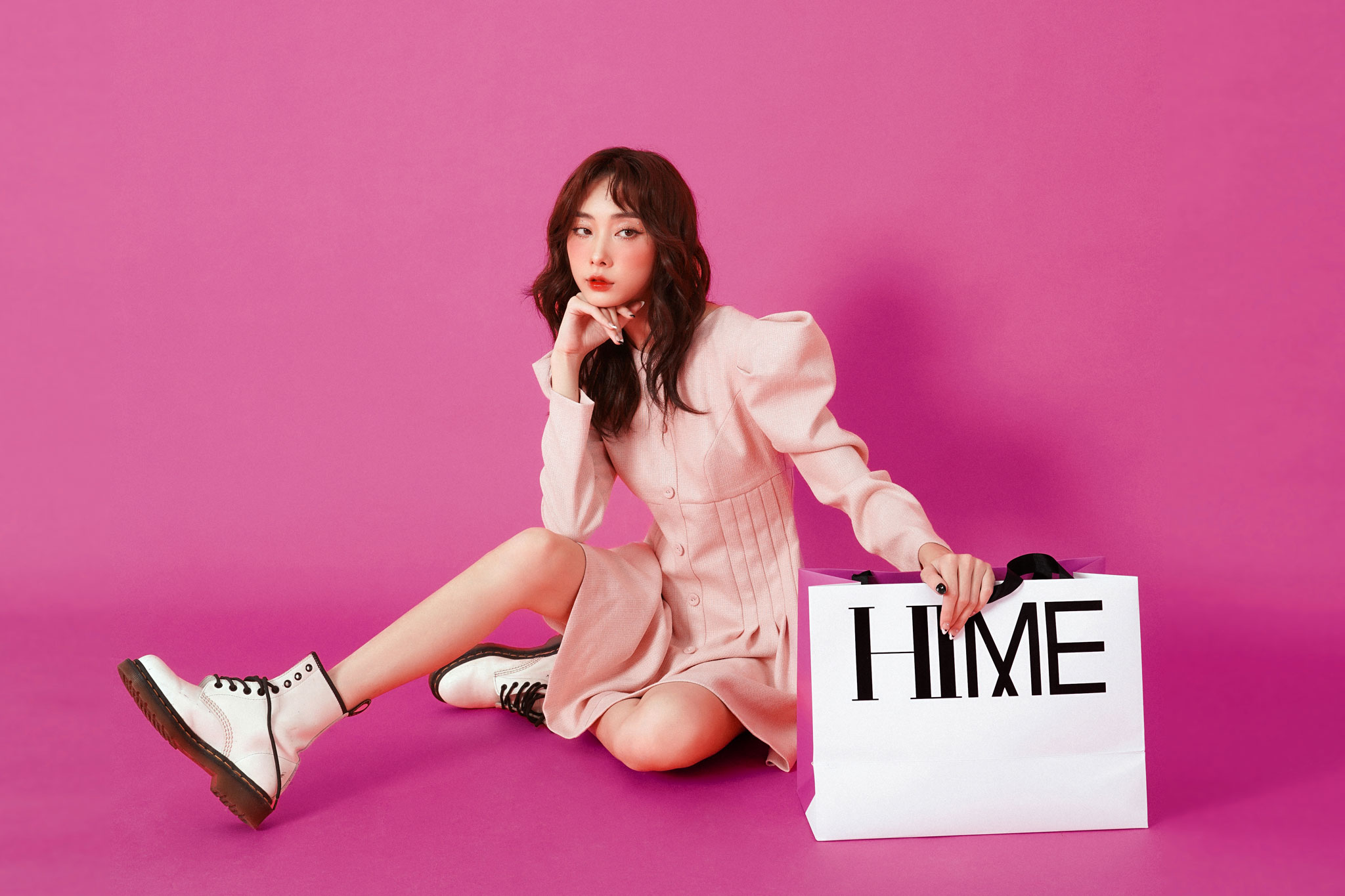
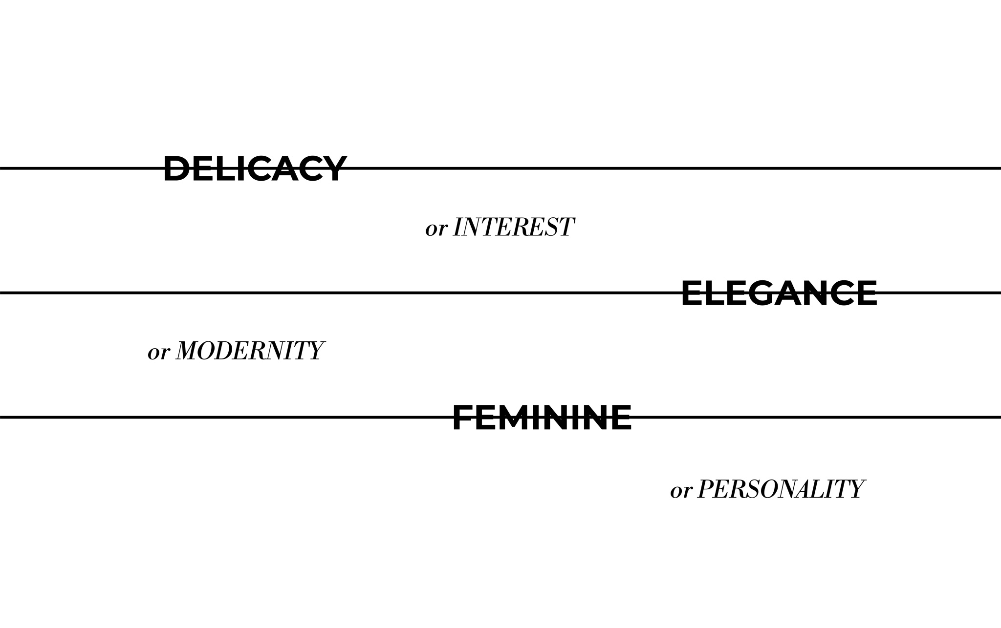
Feminine yet so bold eleagant yet so trendy delicate yet so interesting. There’s no place for boredness in women's fashion.
Strategic Consulting
Brand Positioning Consulting
Brand Story
Design Logo
Brand Identity
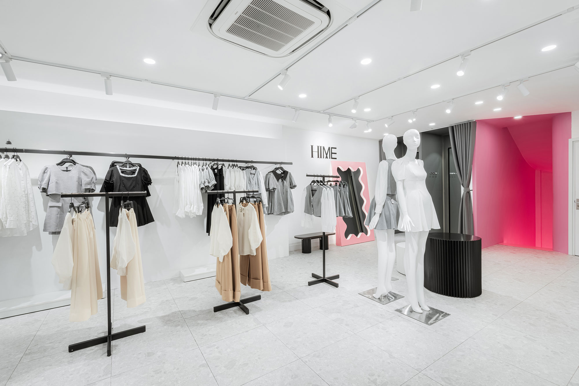
Brand Space
The market for women's fashion between the age of 20-25 is a red ocean where numerous brands compete with each other in style, quality, and price. Each of them will pursue a certain style to meet the need of the target audience.
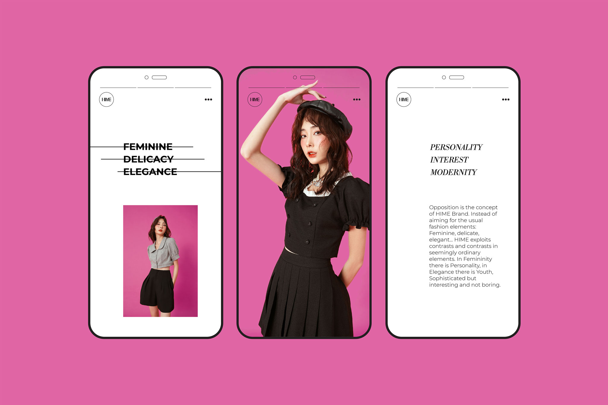
However, we have witnessed a change in the customer's mindset. Women no longer want to be seen as “too” feminine. They want to demonstrate more layers and get out of their comfort zone to explore and express more about themselves, which brought us to a challenge: Create a brand with a stand-out fashion concept.
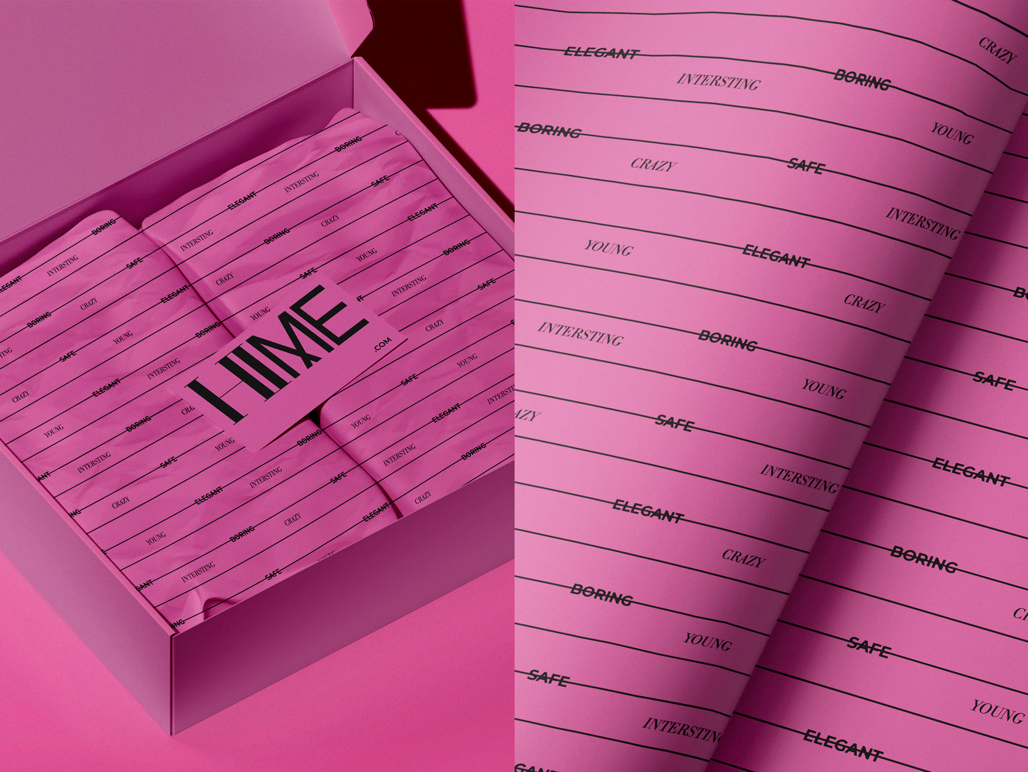
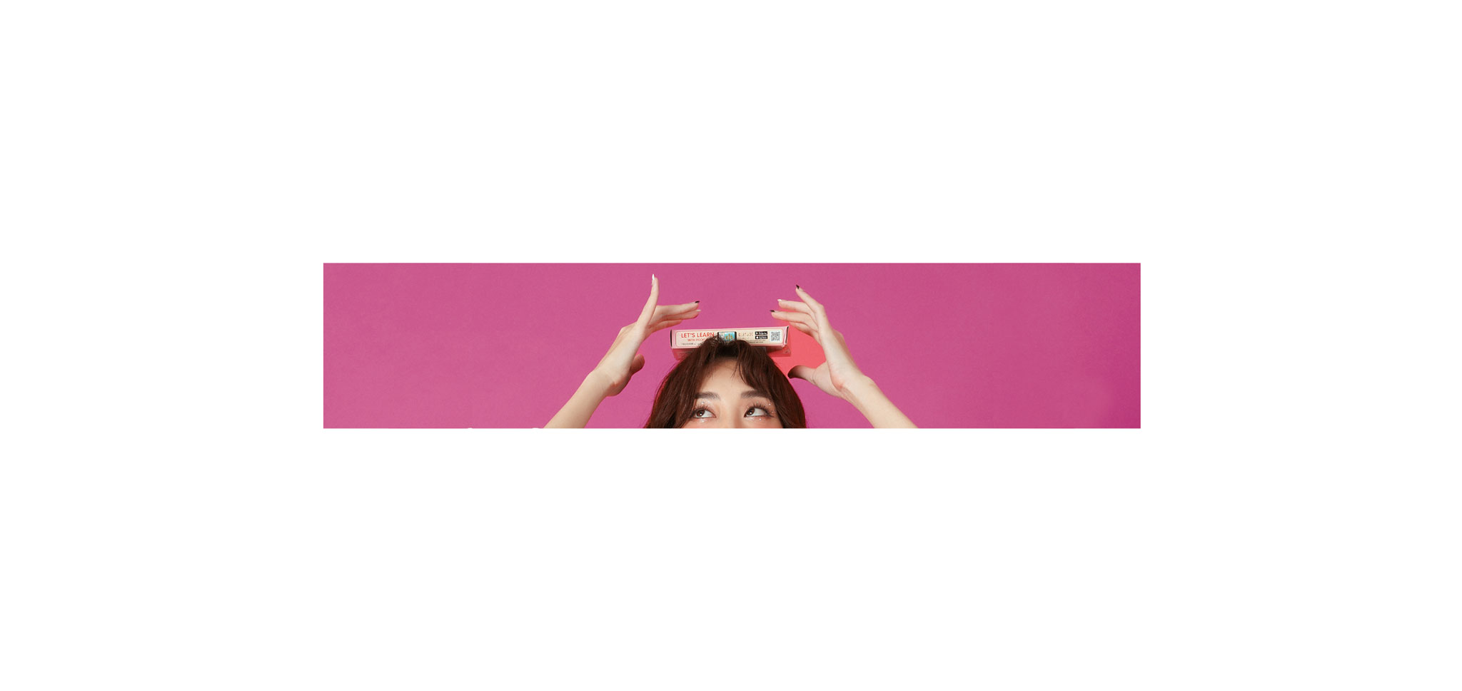
Contrast is the core of our proposed Brand Story for HIME. Instead of using well-known concepts to define HIME’s positioning, we emphasize the contrast in HIME’s fashion to make it outstanding: FEMININE YET SO BOLD, ELEGANT YET SO TRENDY, DELICATE YET SO INTERESTING.
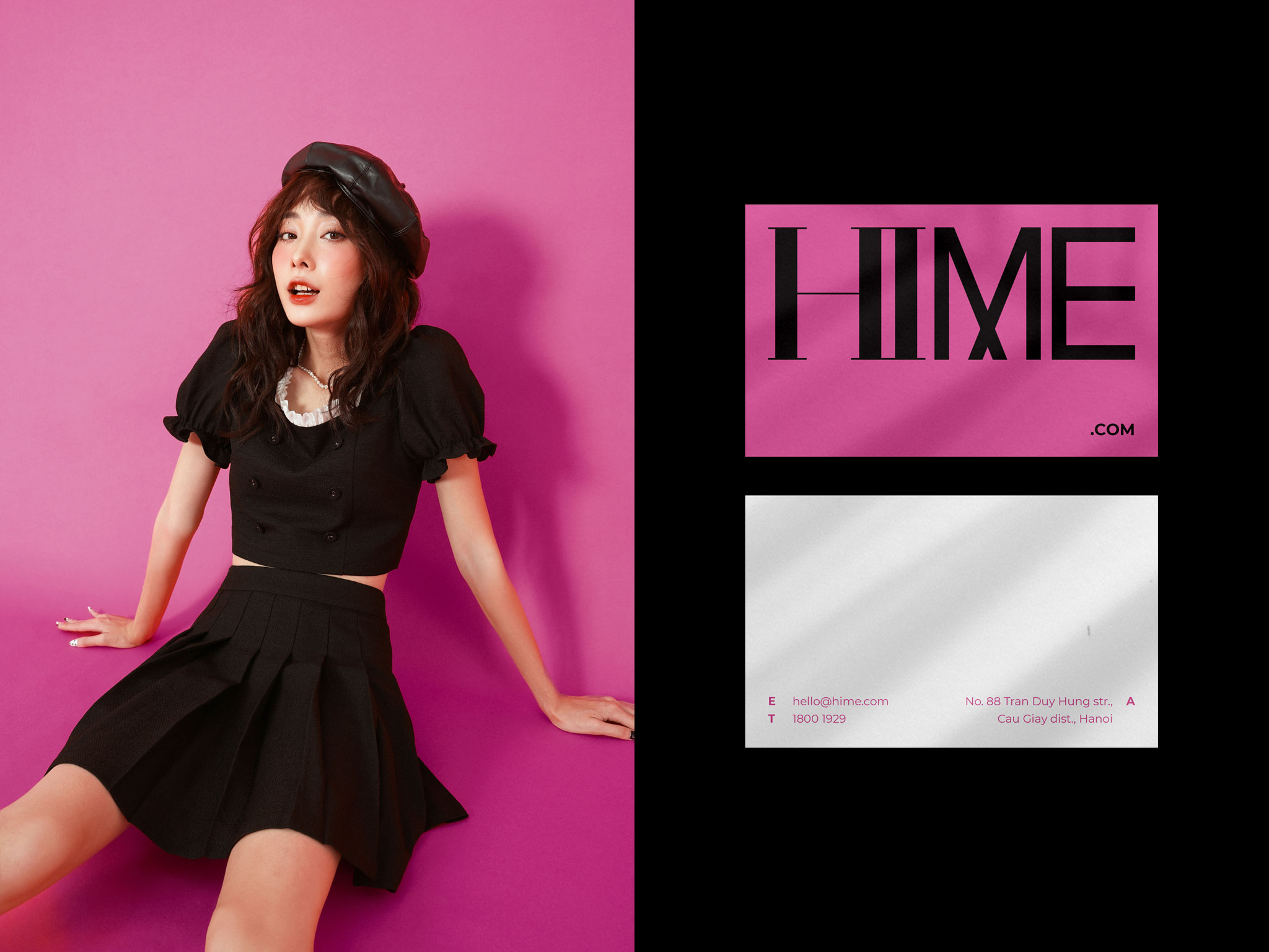
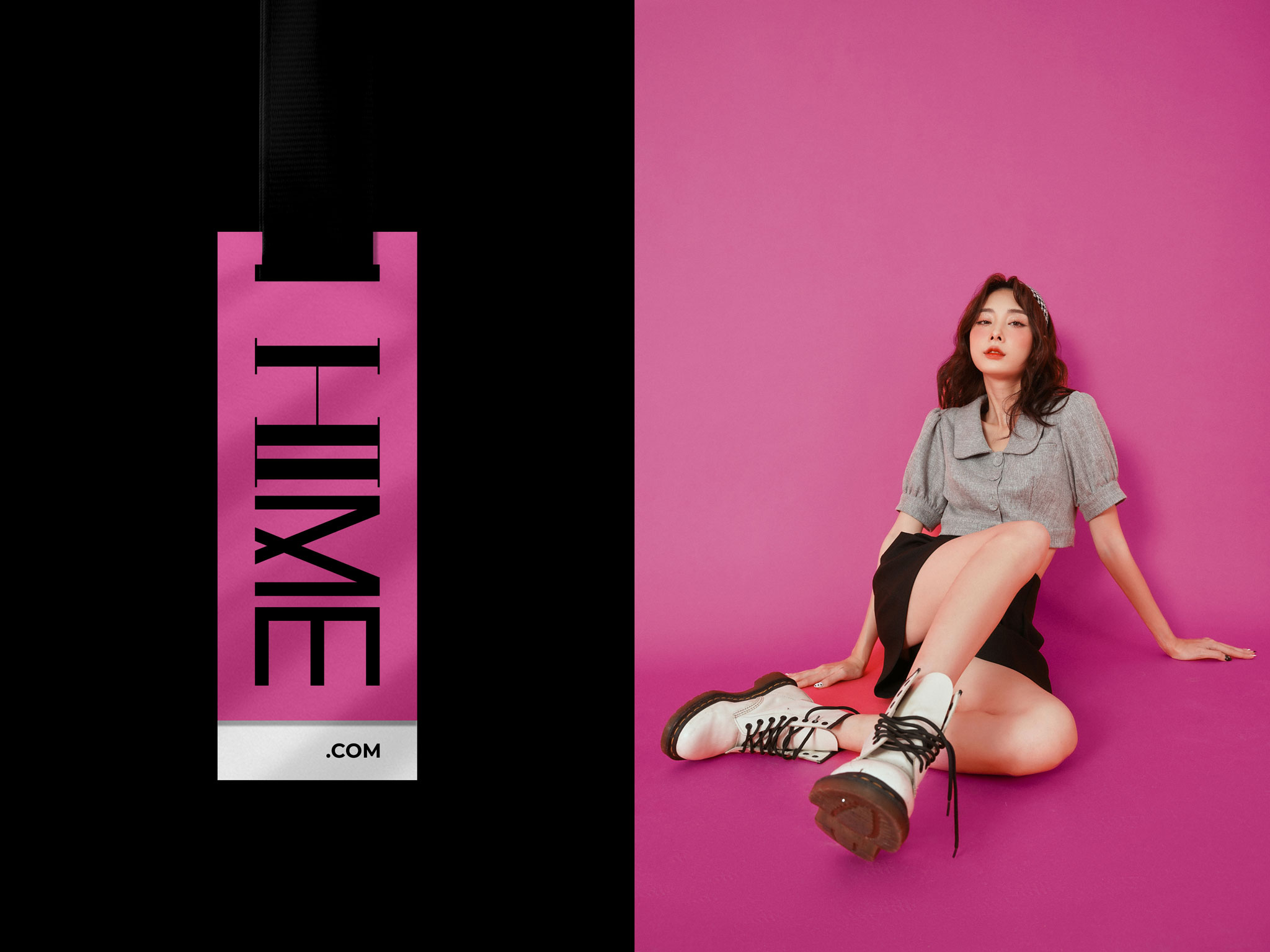
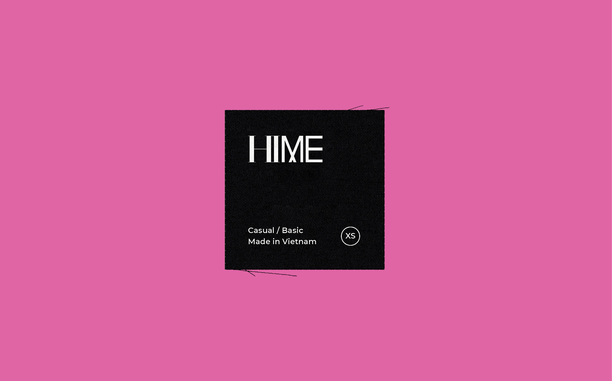
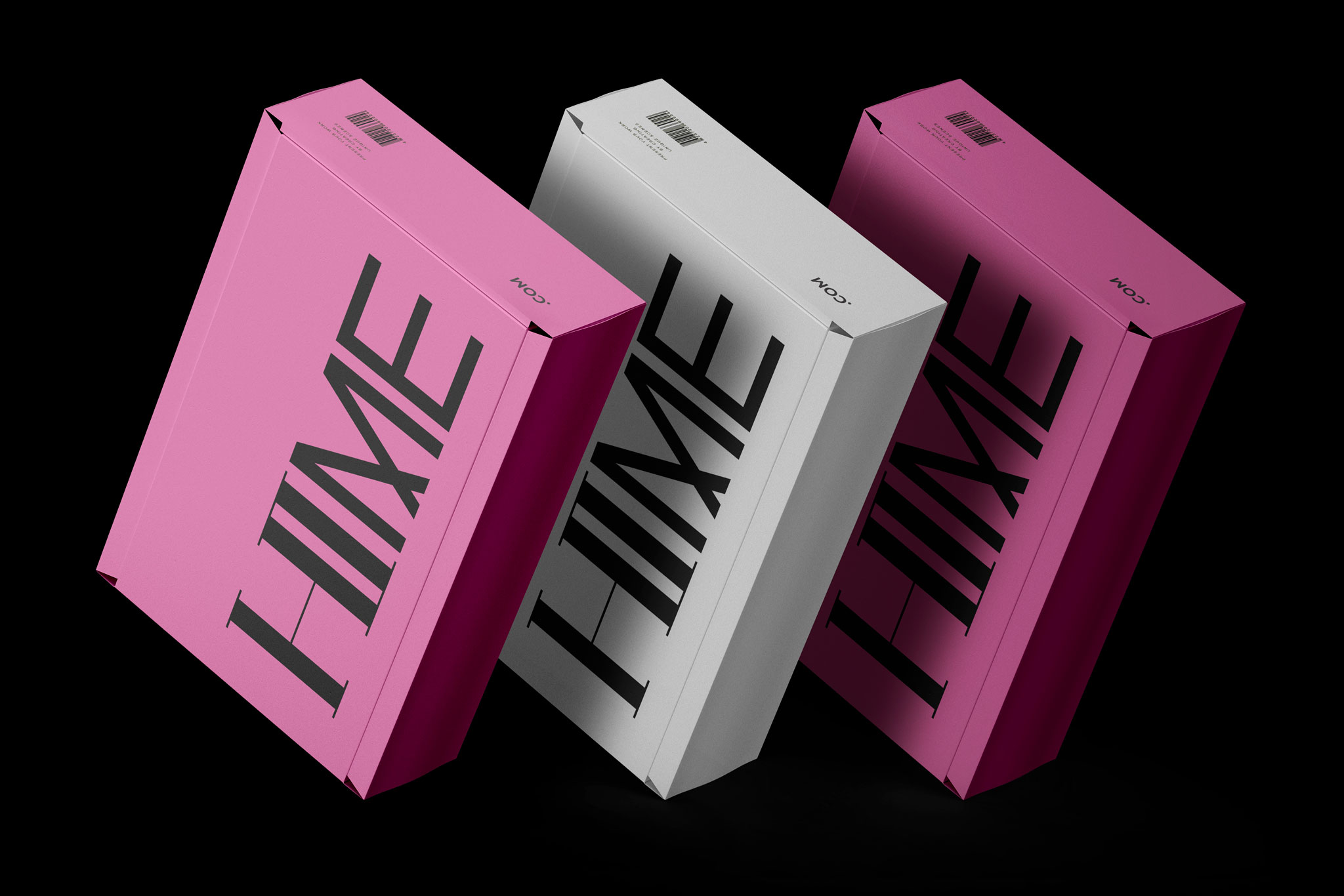
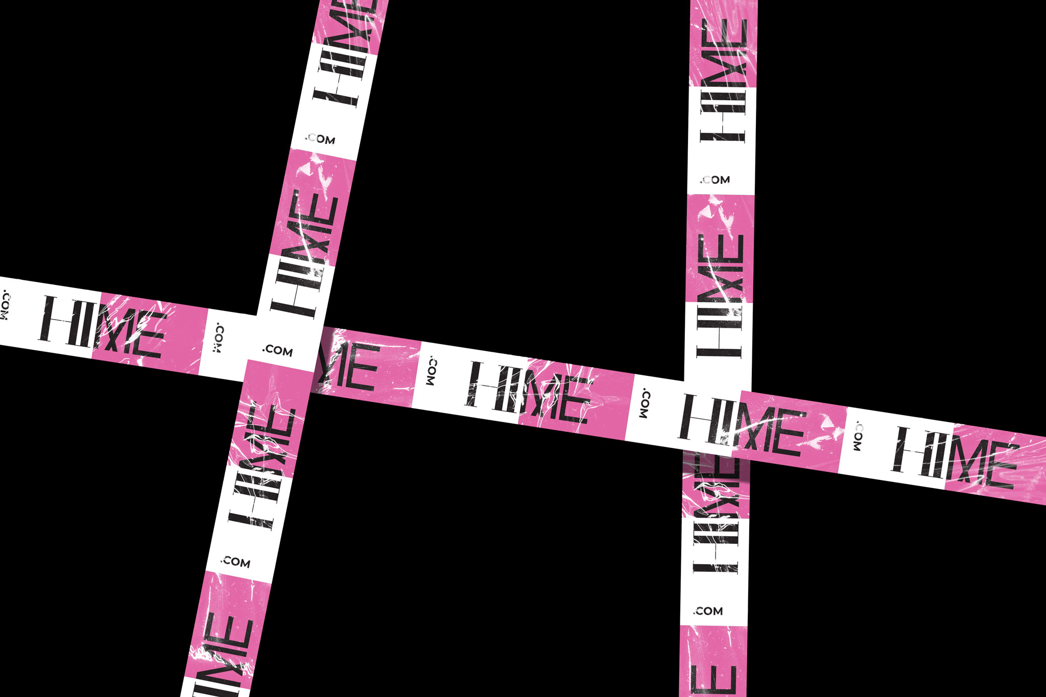
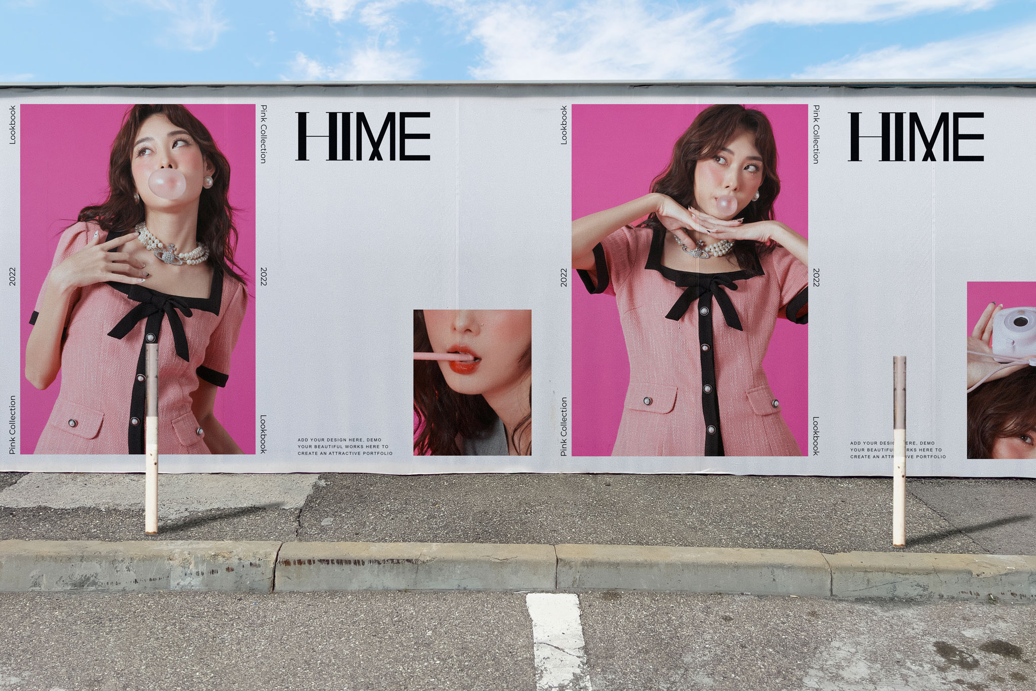
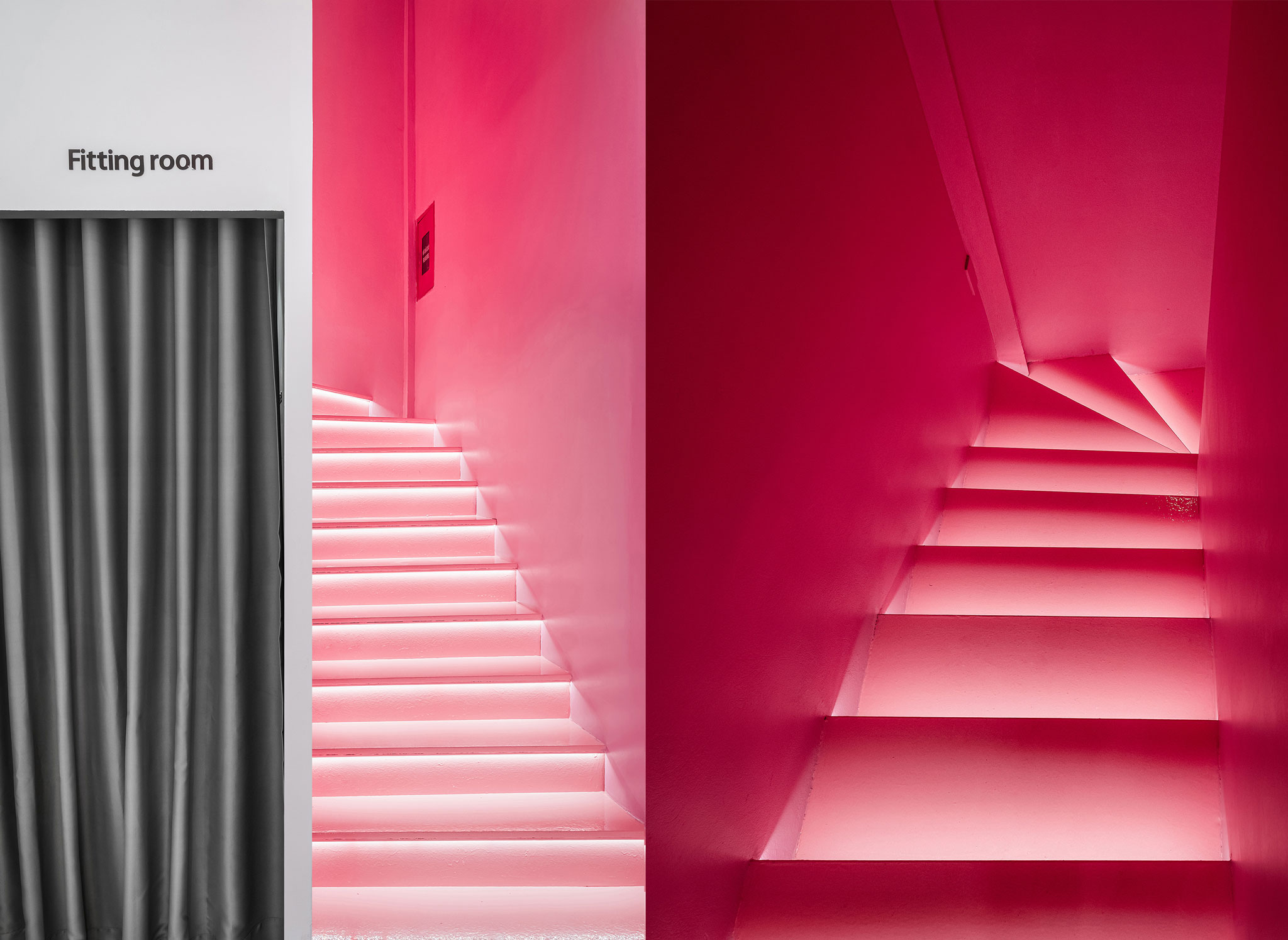
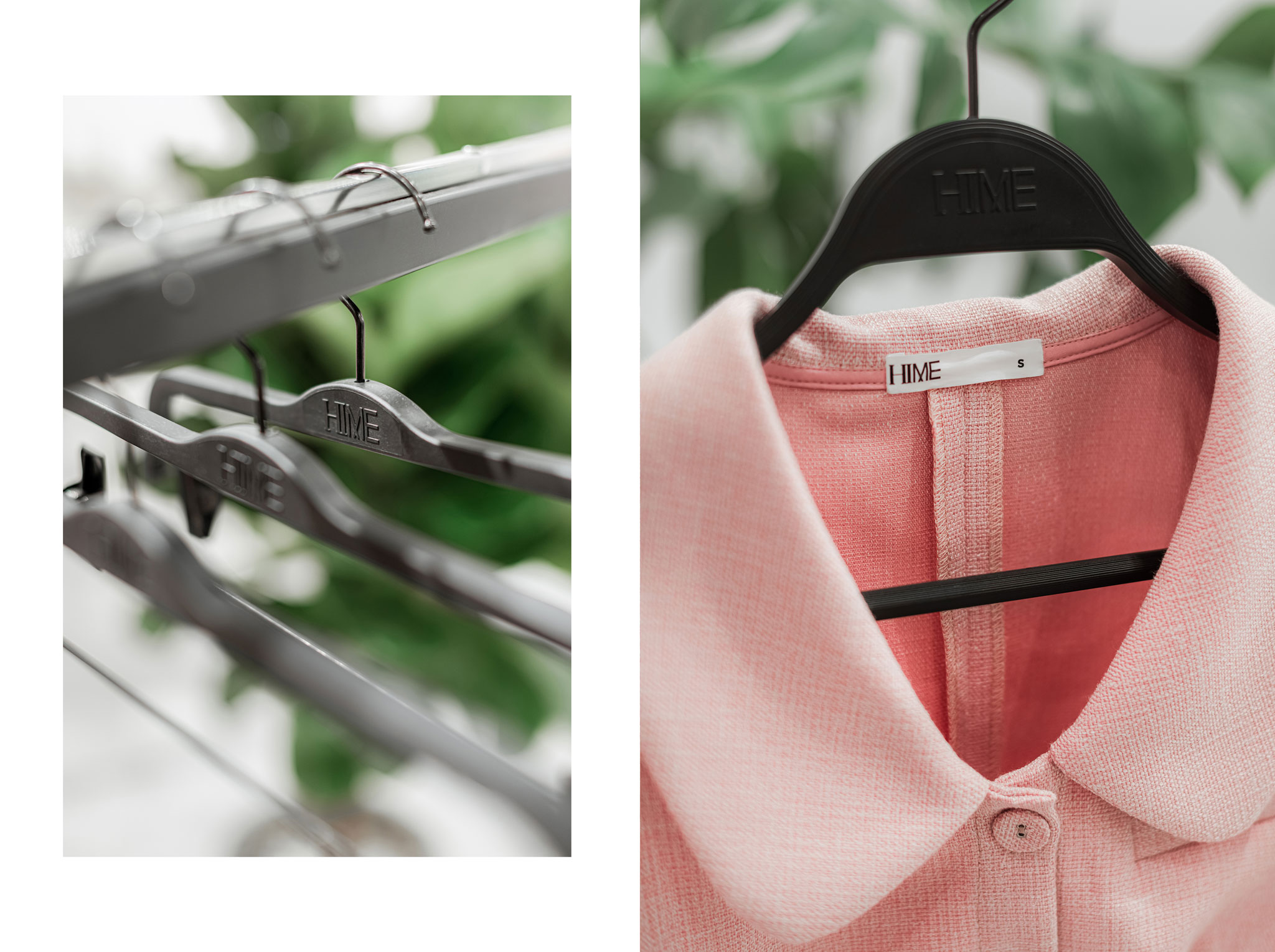
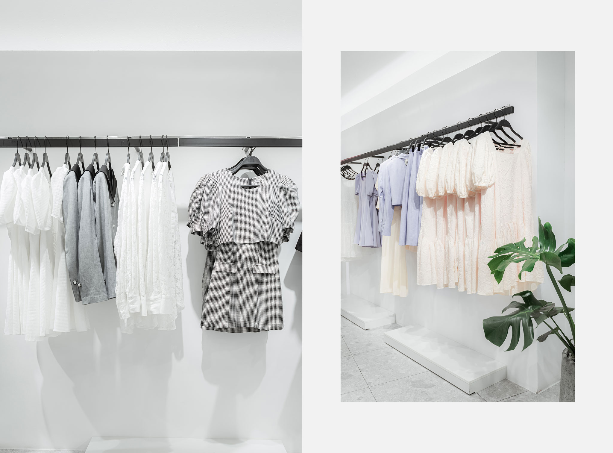
We constantly use contrasting elements to create HIME’s brand identity. The logo is designed based on two opposing parts "HI" and "ME" with contrasting types of font (serif and sans serif fonts), and the co-existence of 2 main colors (White & Pink), which emphasize the contrast in style and personalities in one design.
