




Wetee
Journey of Dainty Teeth
Strategic Consulting
Brand Positioning Consulting
Brand Story
Logo Design
Brand Identity
Mascot Design
Packaging Design
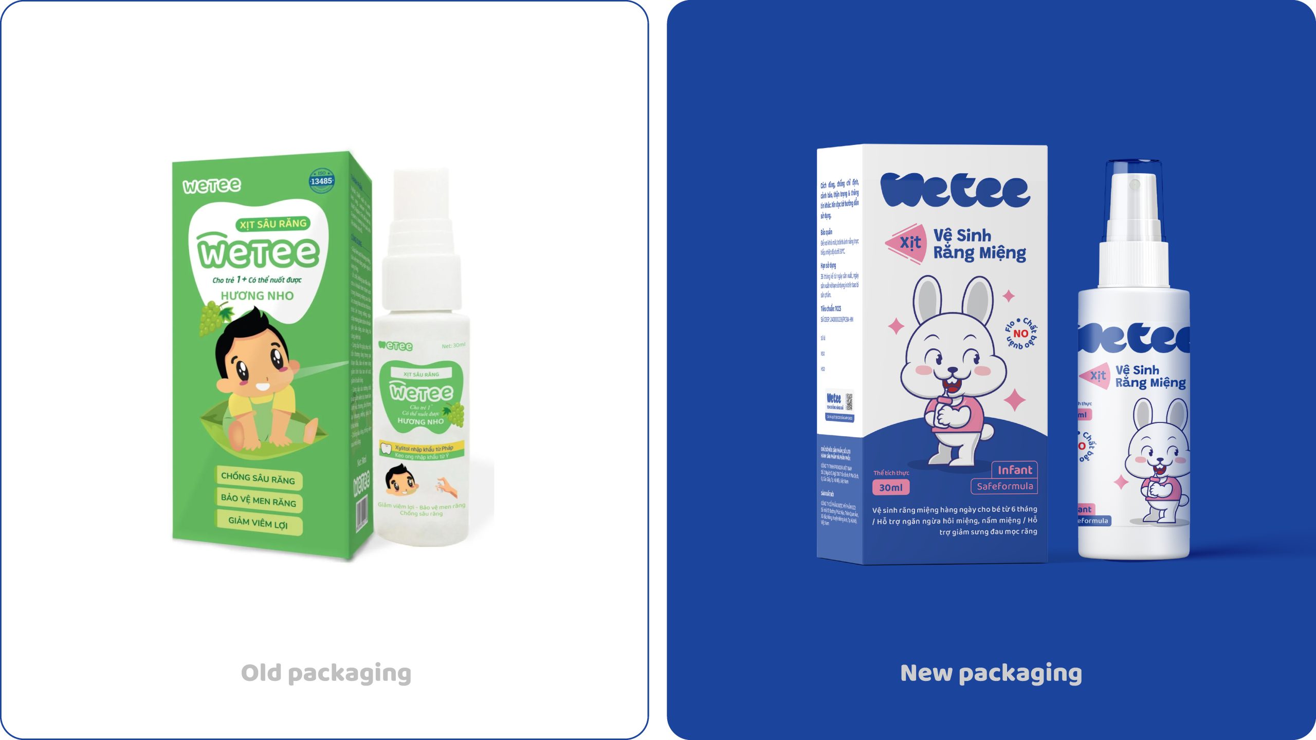
Wetee is a brand of oral care products for children aged 6 months to over 3 years old. Similar to most pharmaceutical products on the market, Wetee focuses on the functionality of the product rather than building a clear brand personality. Additionally, the brand identity is pale and lacks vibrancy.
We advise Wetee to have the "Reliability" of a pharmaceutical product while also being "Friendly and Eye-catching" like a consumer product. In the future direction, the product will not only appear on digital platforms but will also advance to shelves at offline retail points of sale for mother and baby product distribution systems. Therefore, along with a differentiation strategy, we recommend the brand to adopt a Brand Highlight strategy with eye-catching, impressive, and unique imagery to enhance the product's competitive advantage on consumer shelves. "Reliability, Happiness, Friendliness" are the characteristics that Wetee brand aims for.
To realize the brand positioning, we propose a redesign of the entire identity, including Logo, Mascot, and Packaging Images.
1. Logo
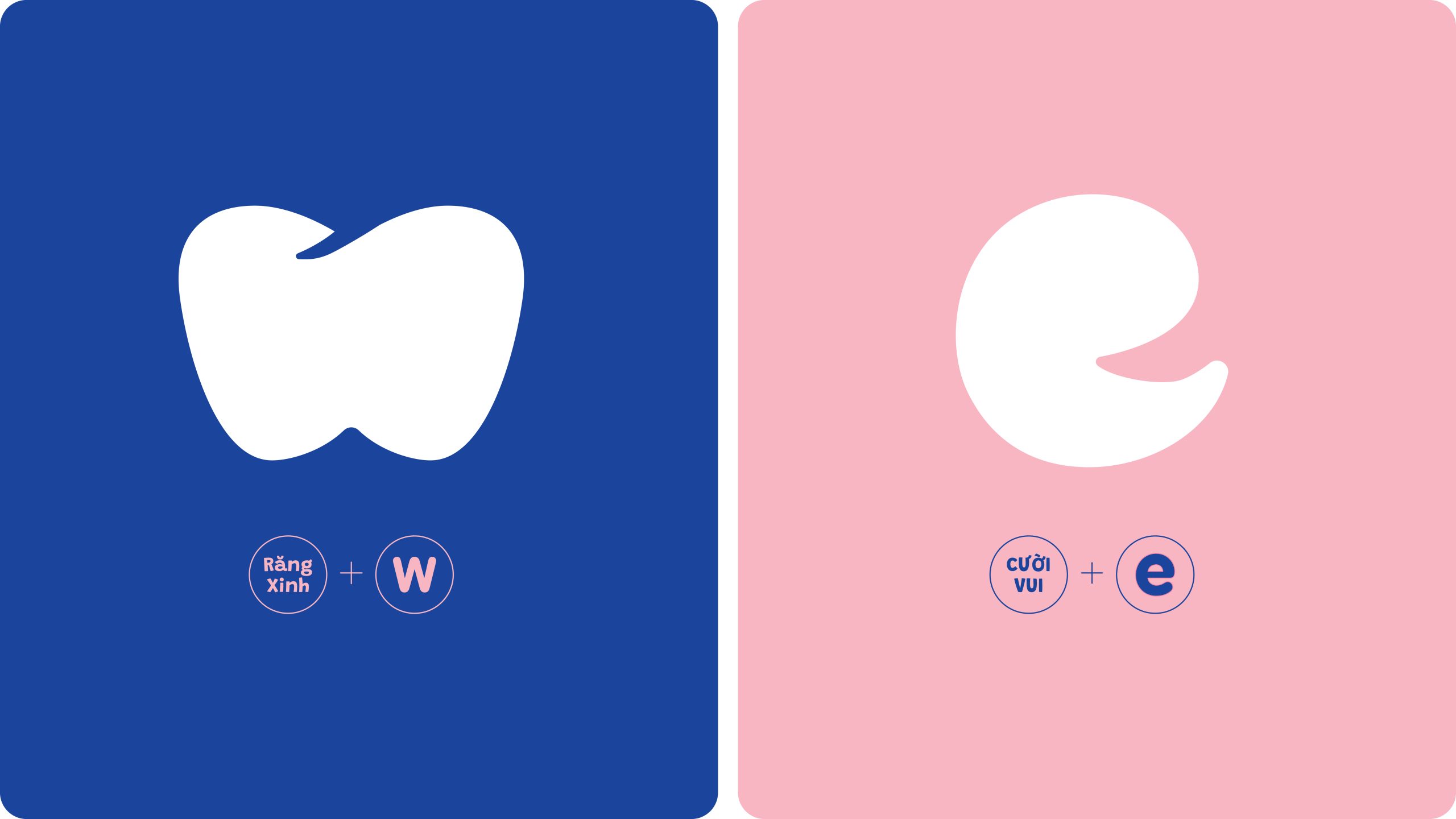
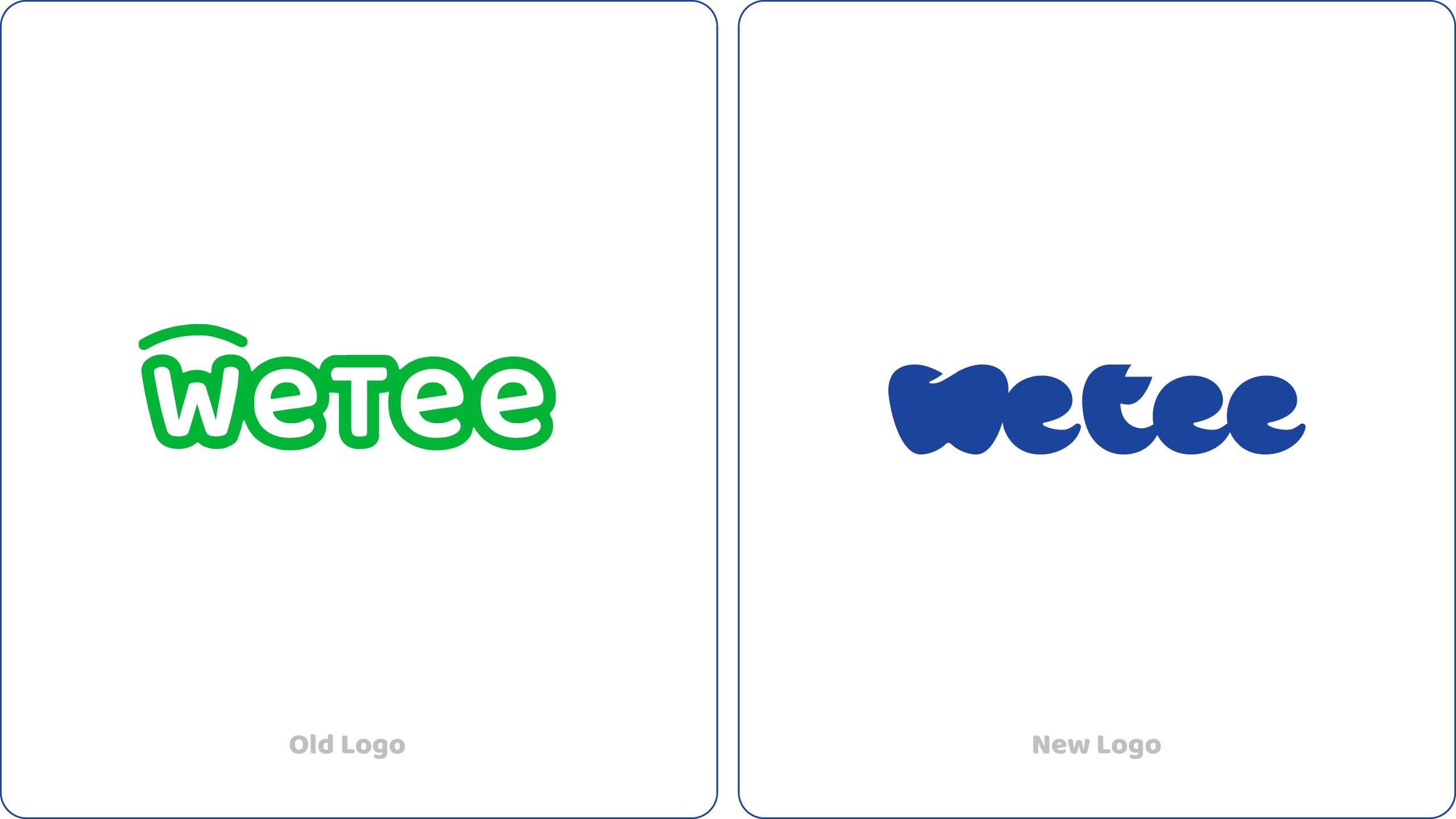
The logo design is inspired by the "Beautiful Teeth" & "Smile" elements. Many brands use Teeth as a symbol, but the usage tends to be "Medical," lacking vibrancy and depth. By creating a text-based logo, we aim for readability, memorability, and a sense of closeness to customers. The logo can be separated into an icon and used flexibly in various scenarios.
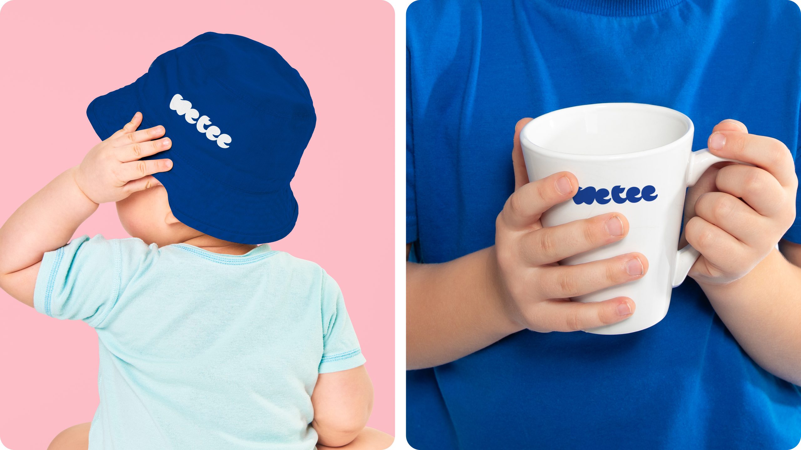
An important point in designing the logo is its applicability to the product packaging. Packaging is the most important touchpoint for the Wetee brand. The logo needs to be compatible with various shapes and proportions of different packaging.
2. Mascot
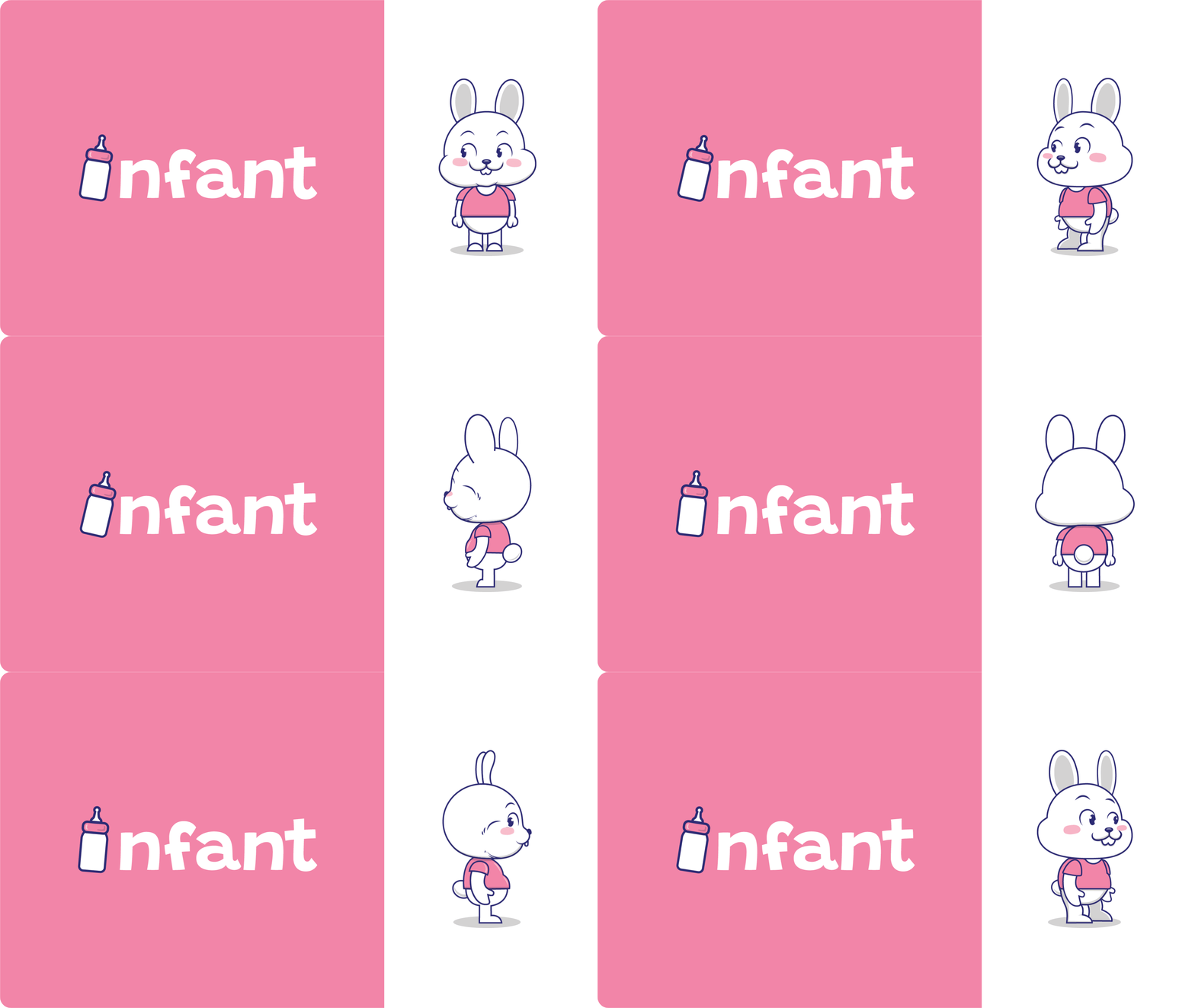
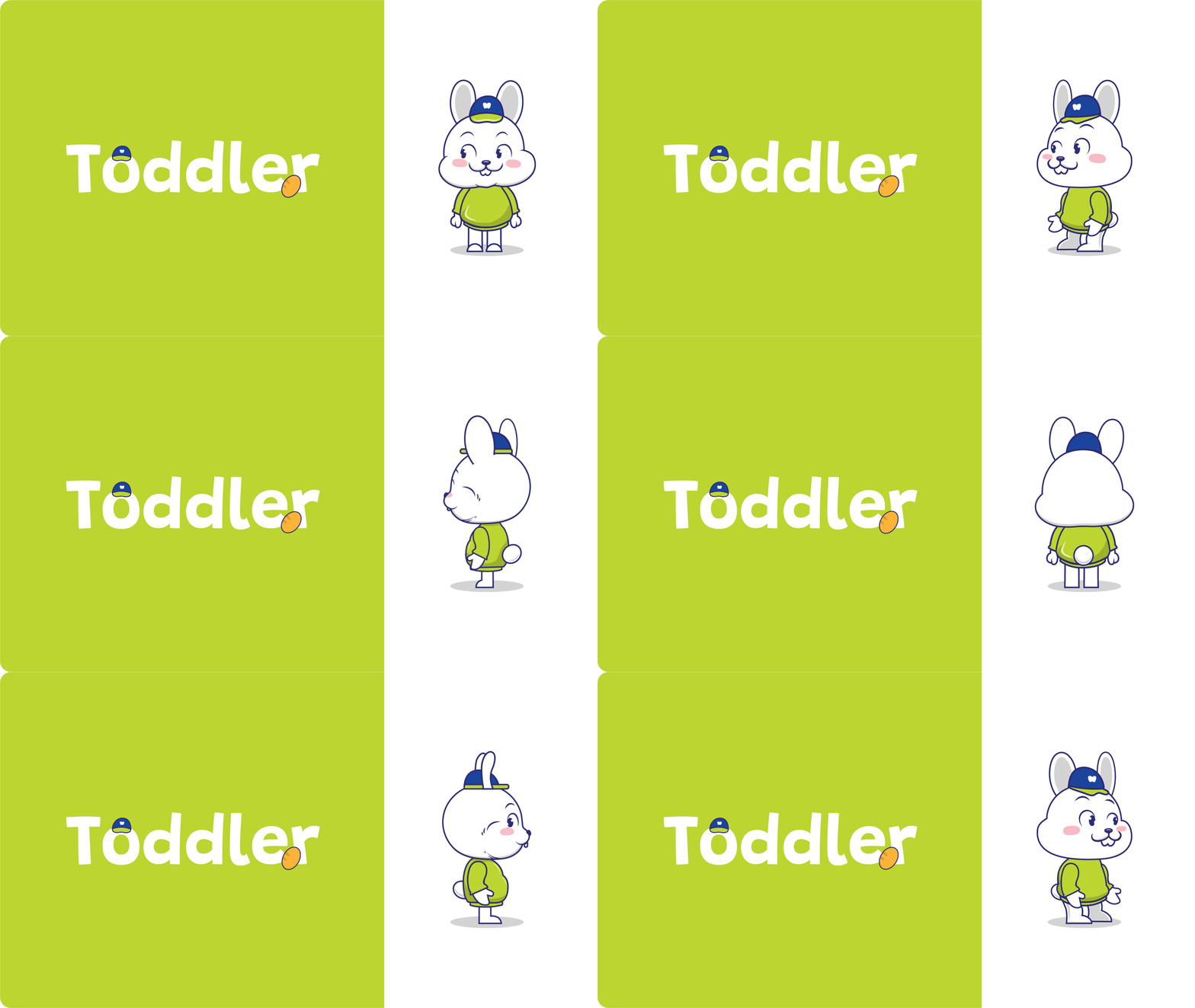
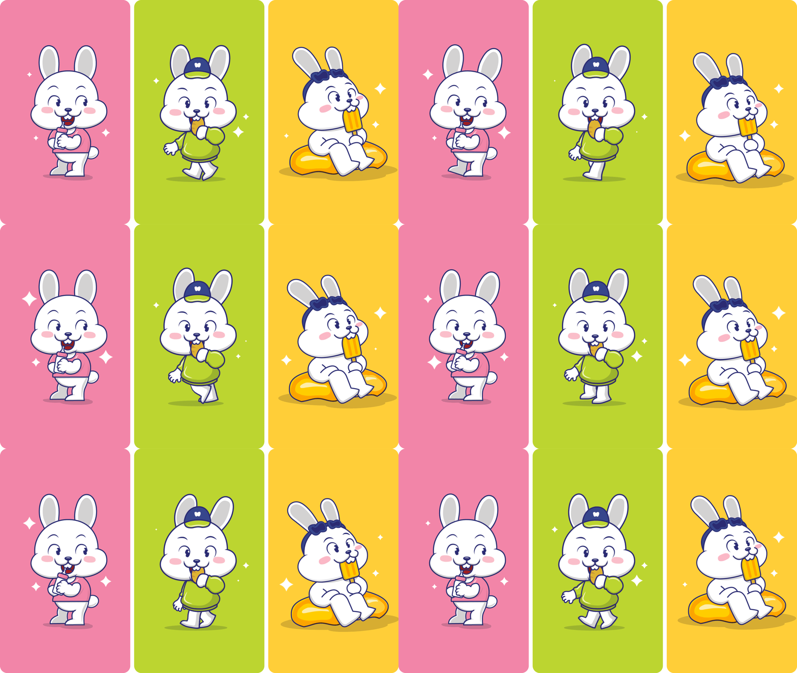
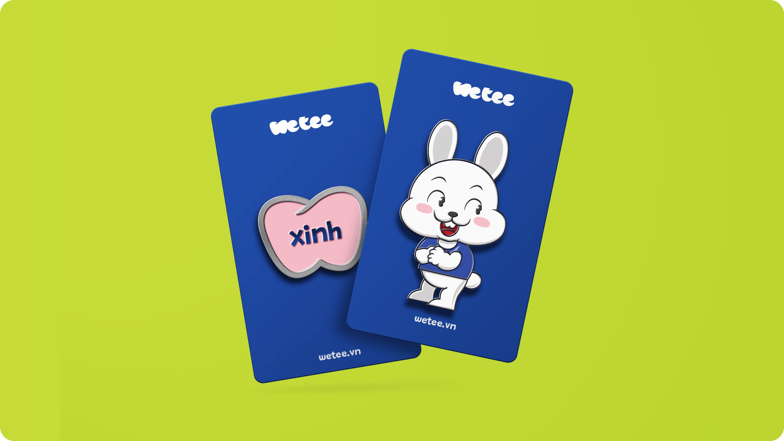
We chose a Rabbit as the brand mascot based on the suitability of four criteria: Positioning, Product, Brand Image Model, and Popularity.
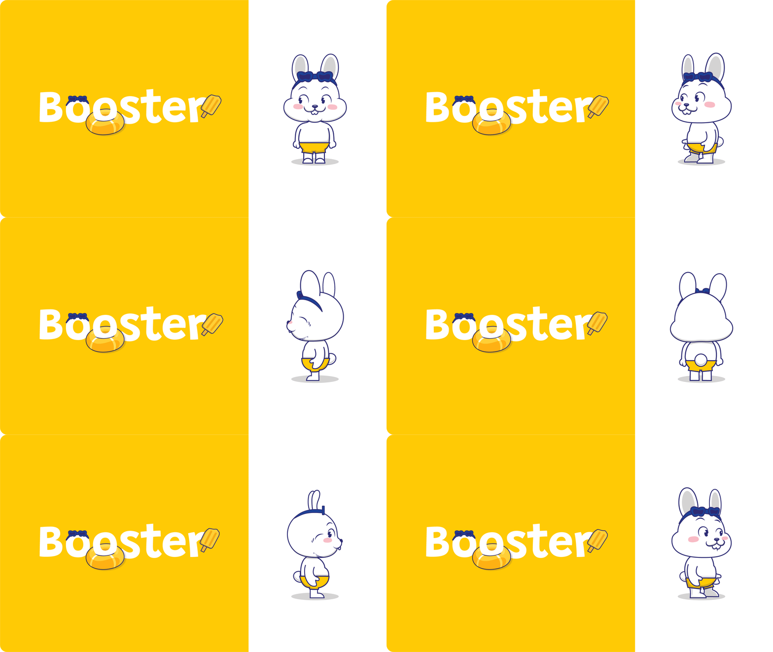
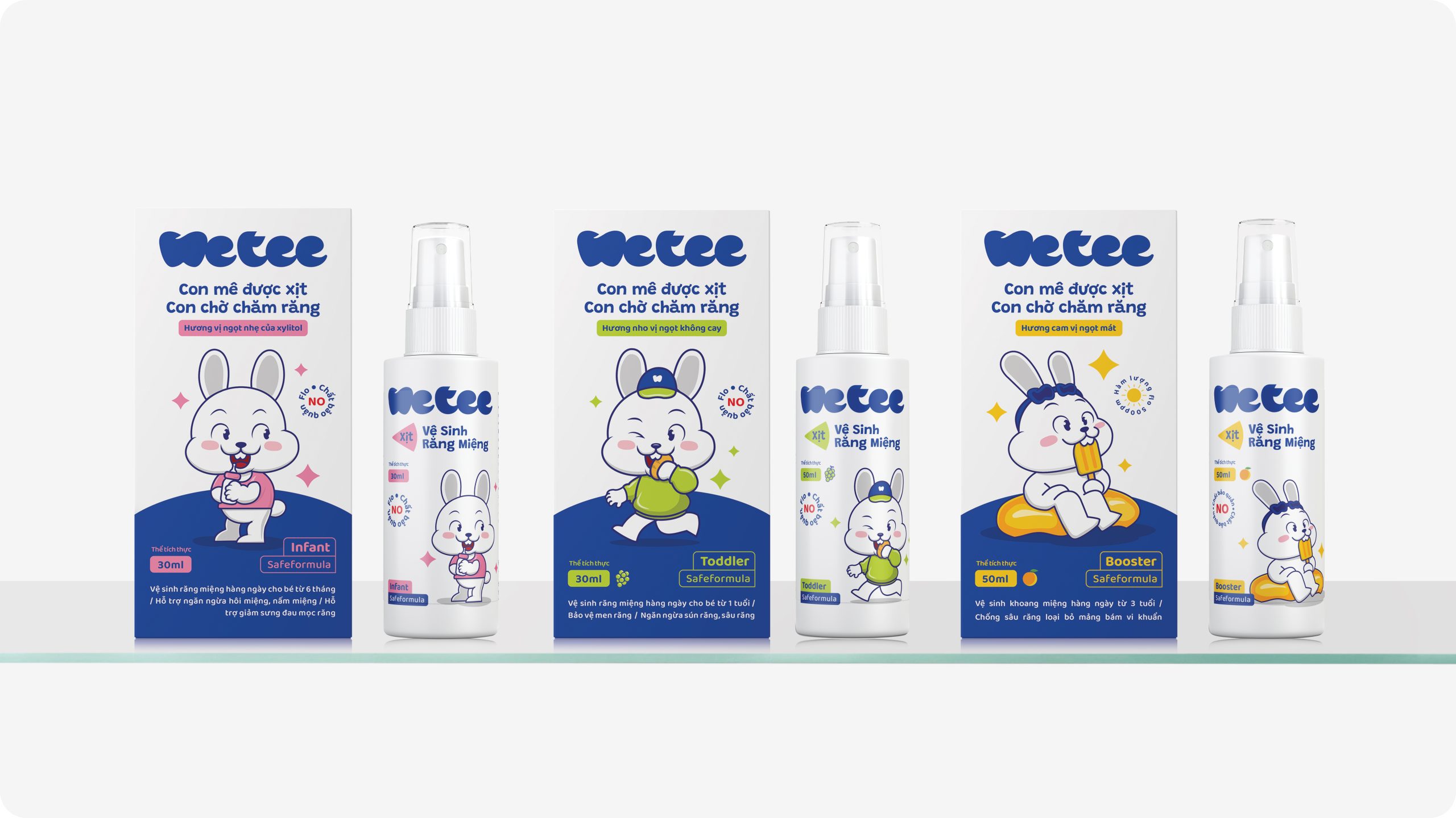
We develop a set of 03 characters corresponding to 03 age groups: Infat - 6 months old, Toddler - Over 1 year old, Booster - Over 3 years old.
3. Packaging:
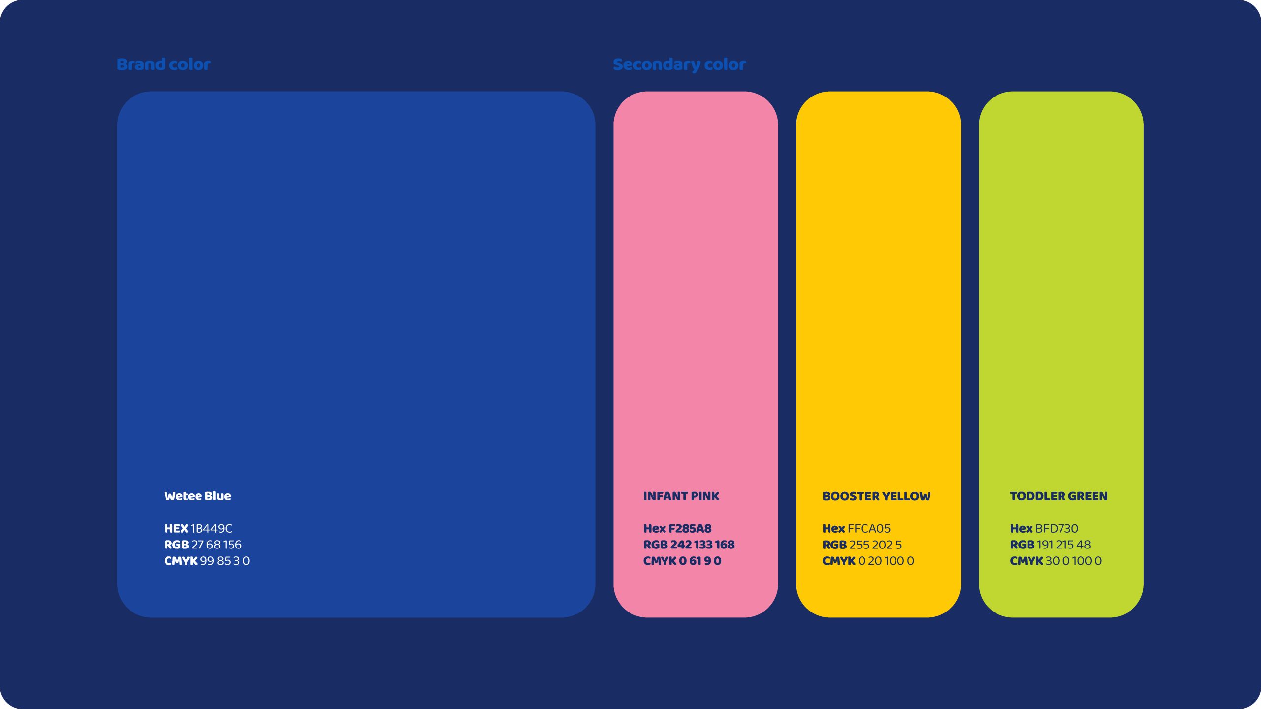
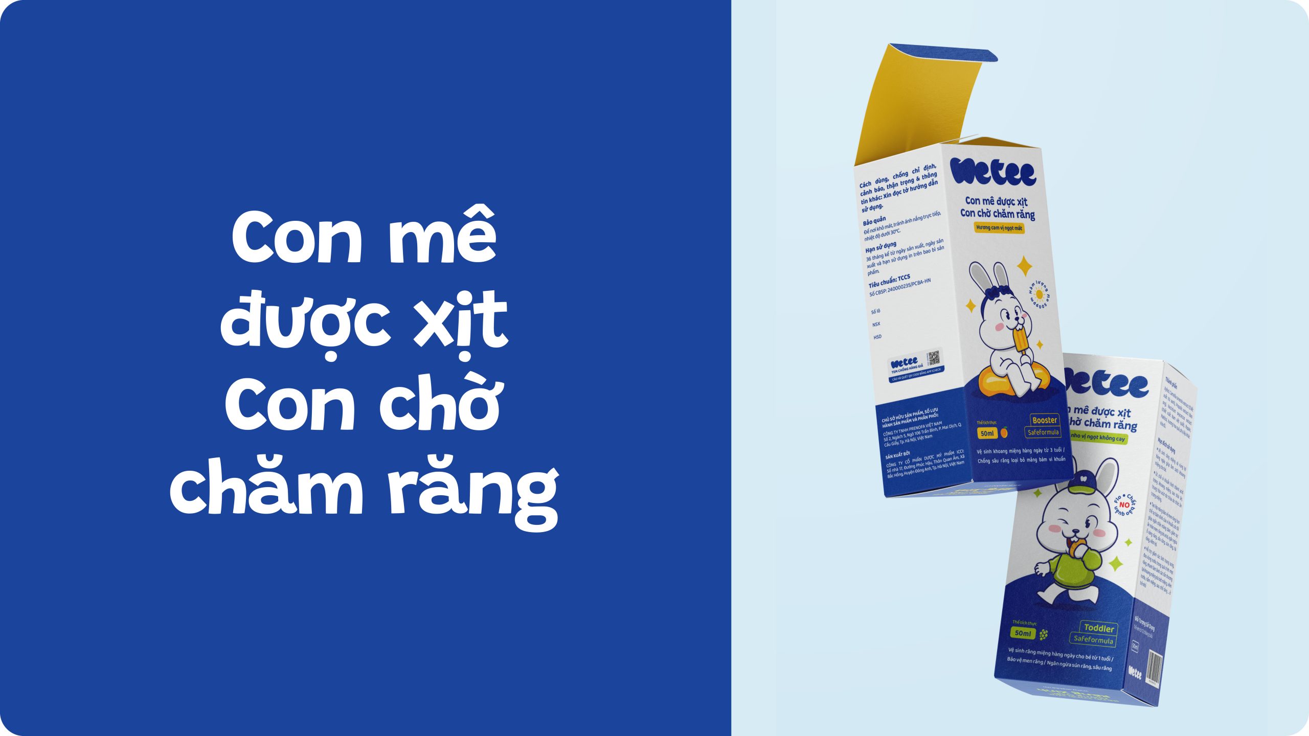
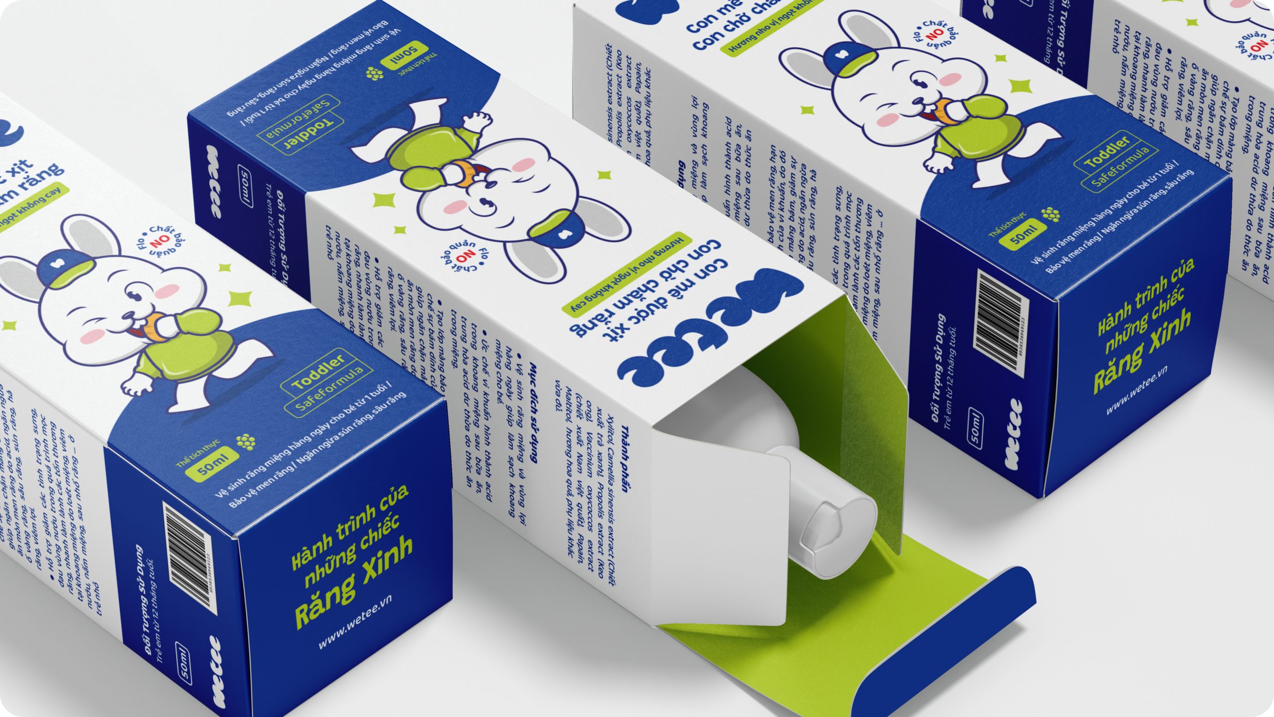
Packaging combines the Mascot with a lively design style. It is eye-catching, impressive, yet still ensures reliability. By balancing White with the Brand's color strip, we blend the feeling between consumer products and pharmaceutical products. The layout is designed to be concise, allowing customers to quickly access information in order of priority.
