Atom
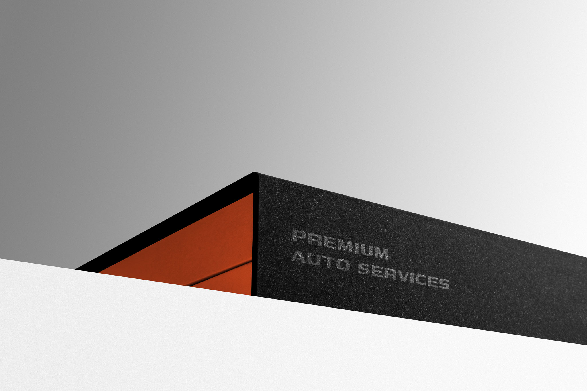
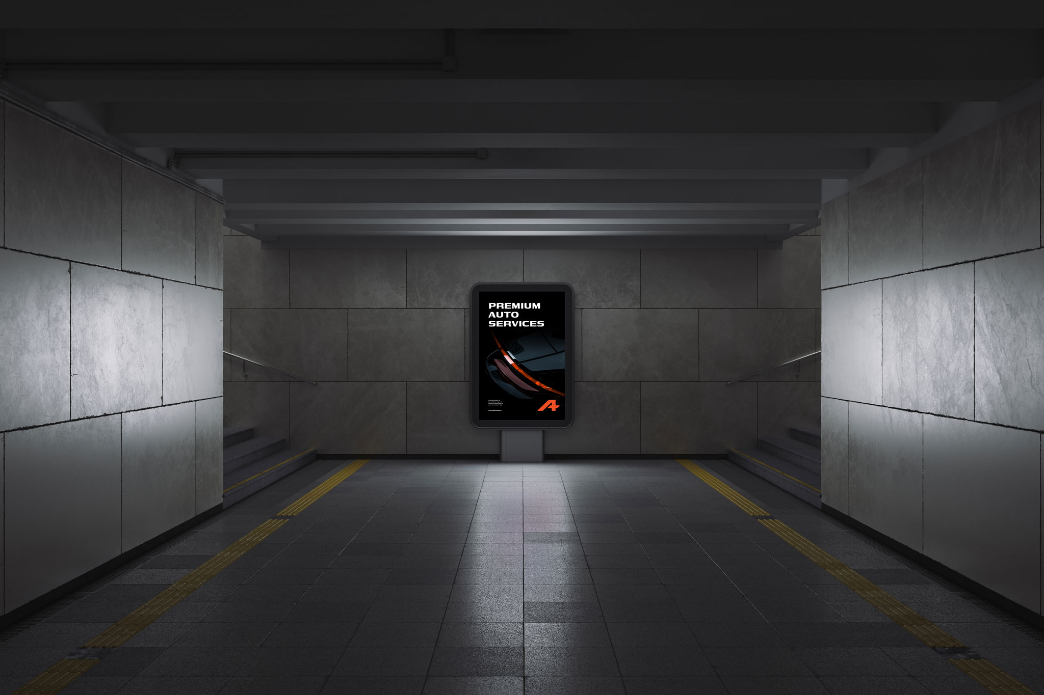
Premium Auto Services - A+ QUALITY
Strategic Consulting
Brand Positioning Consulting
Brand Story
Logo Design
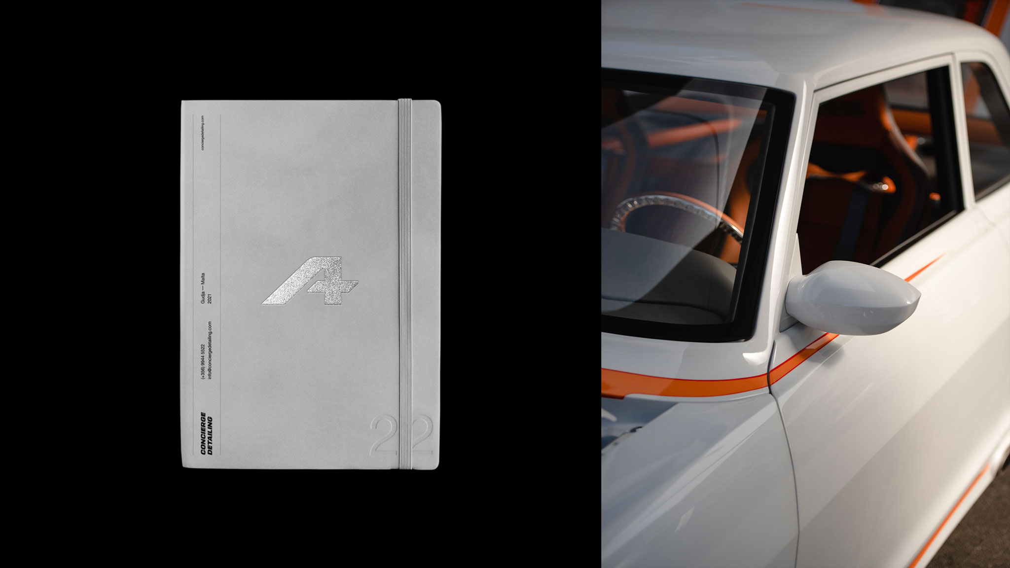
Brand Identity
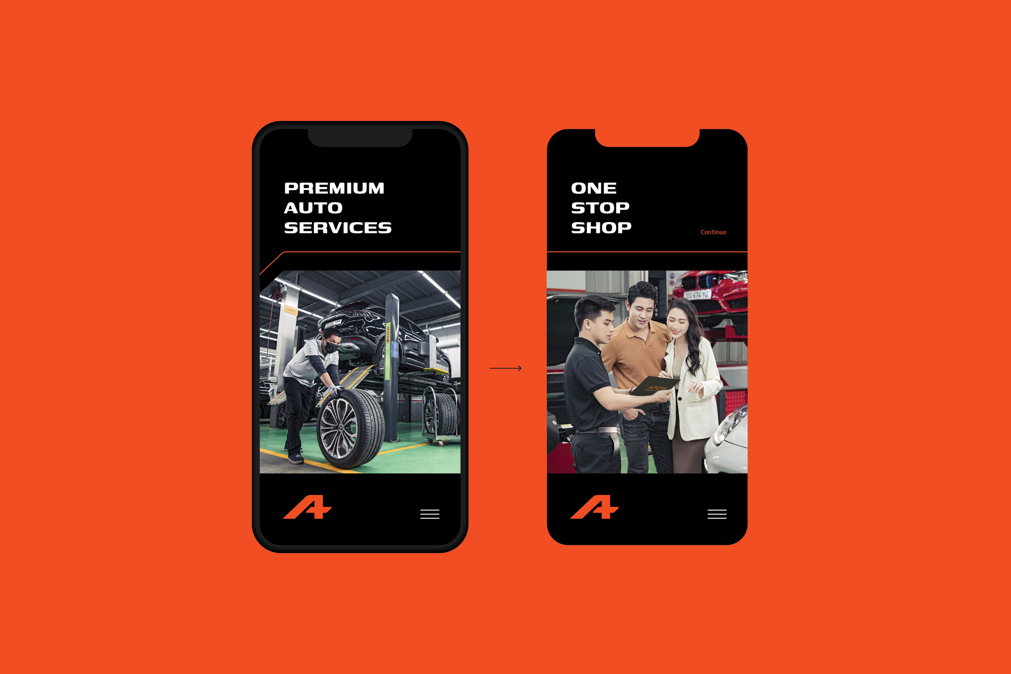
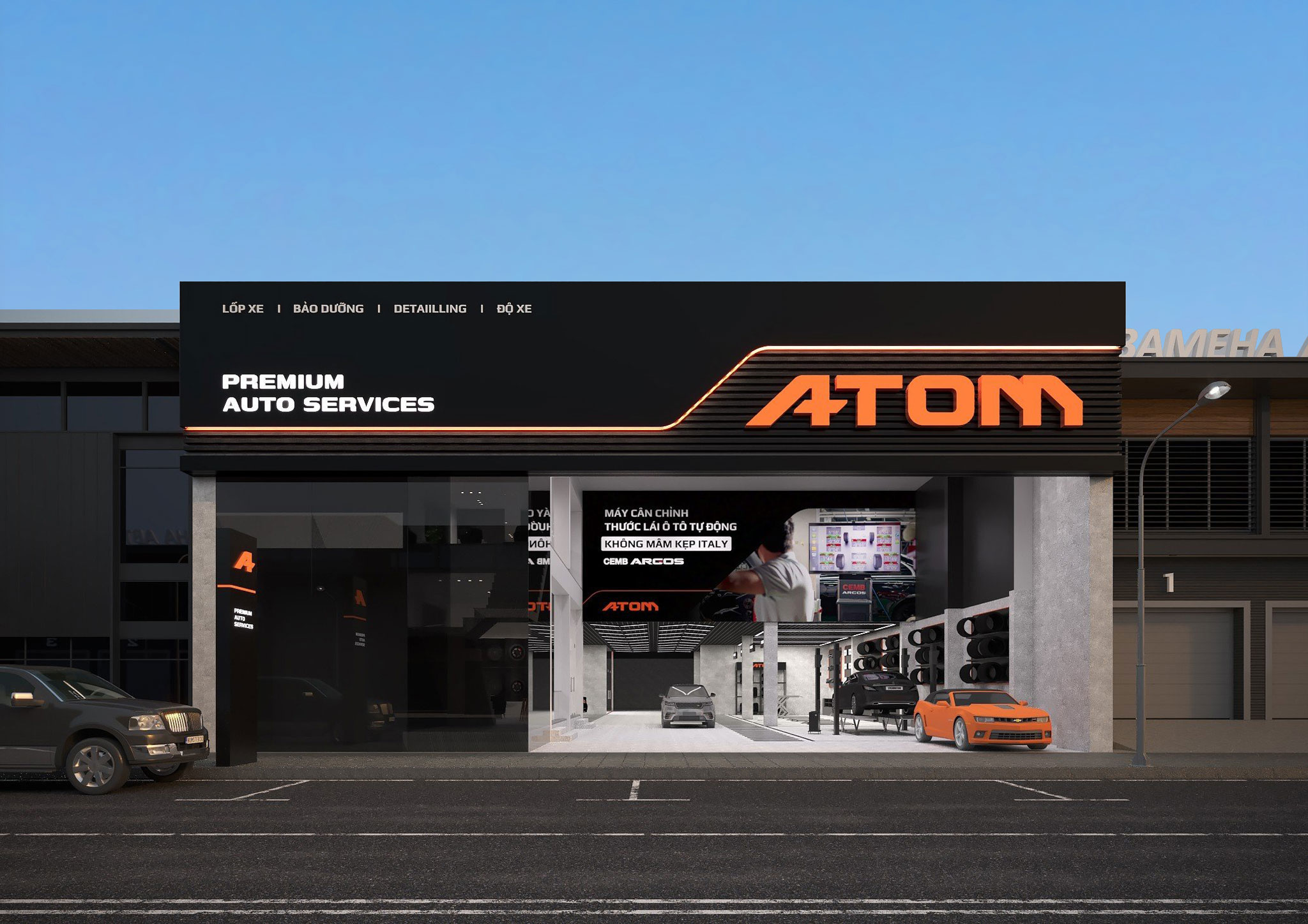
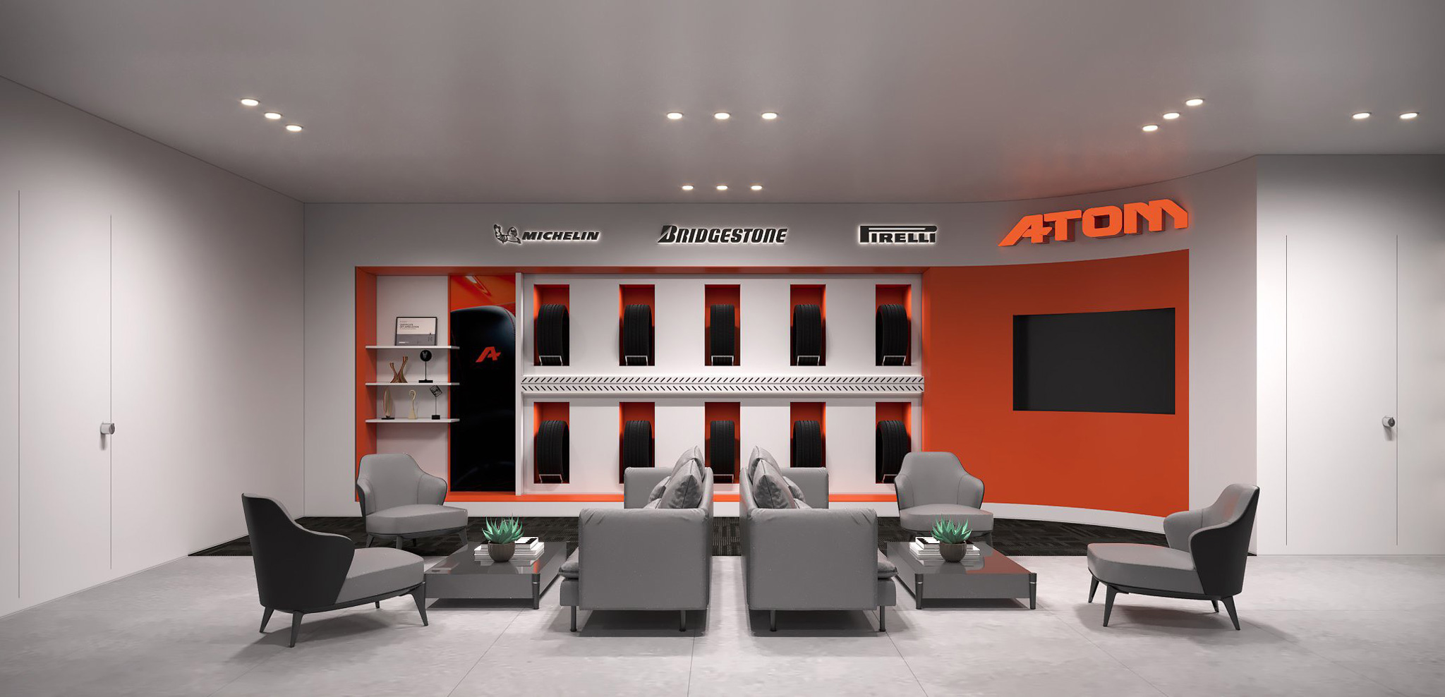
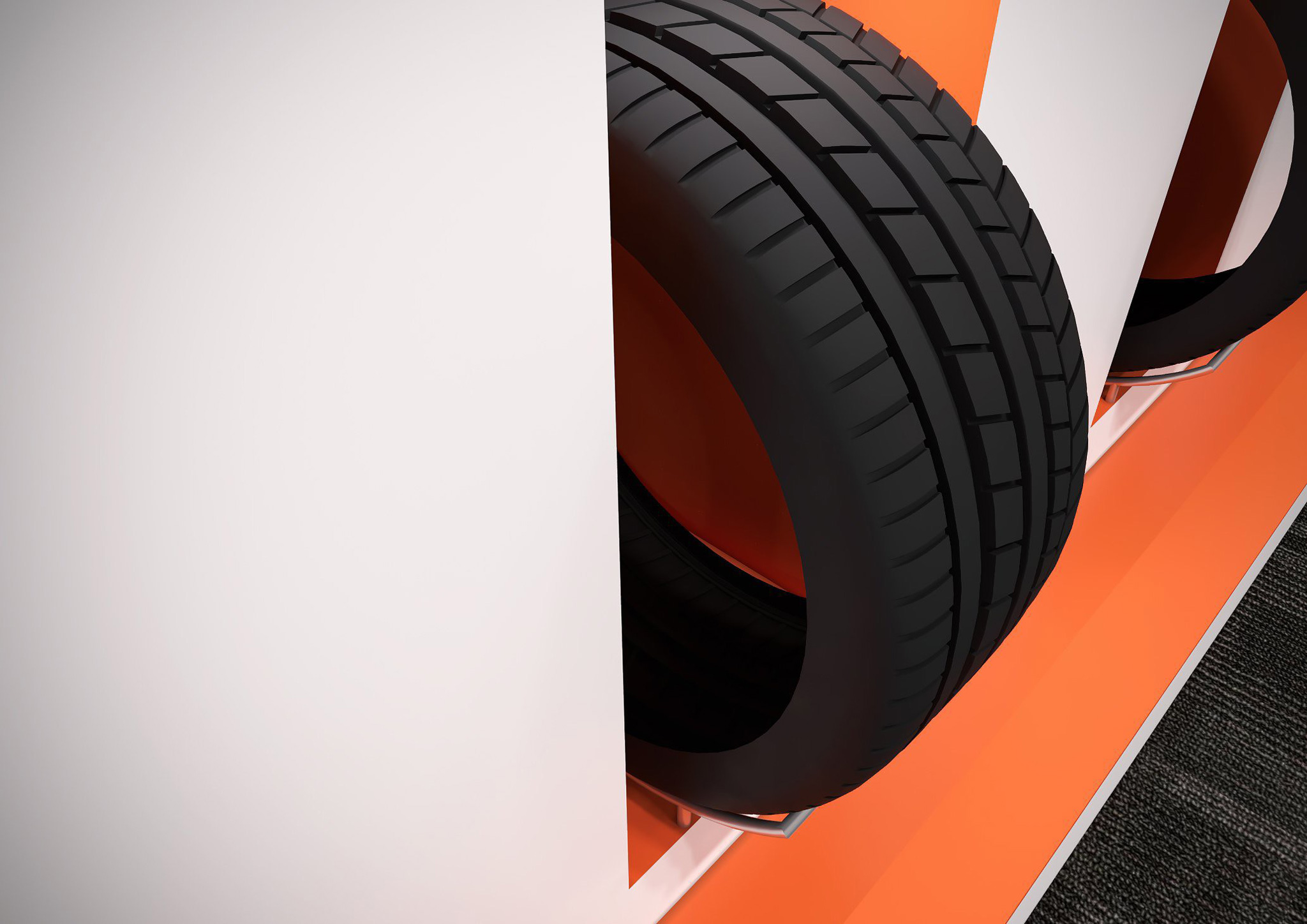
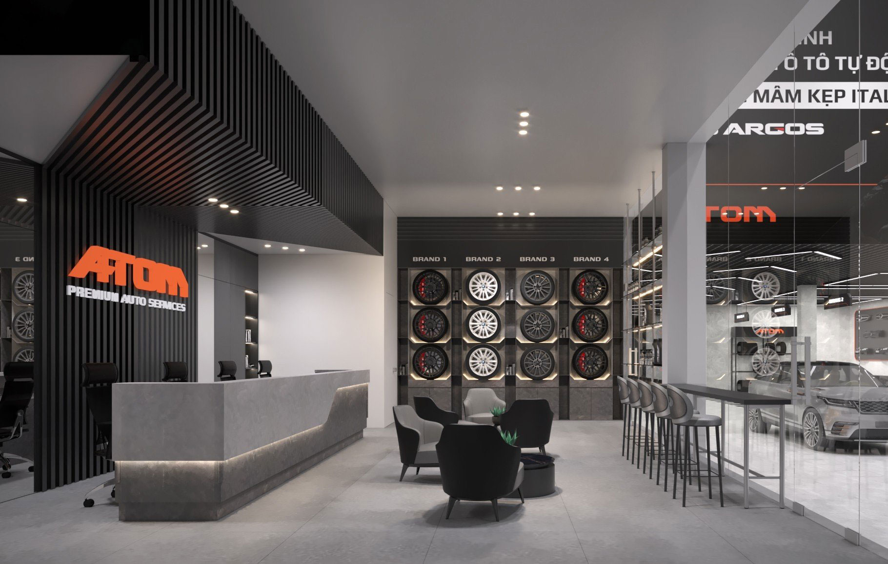
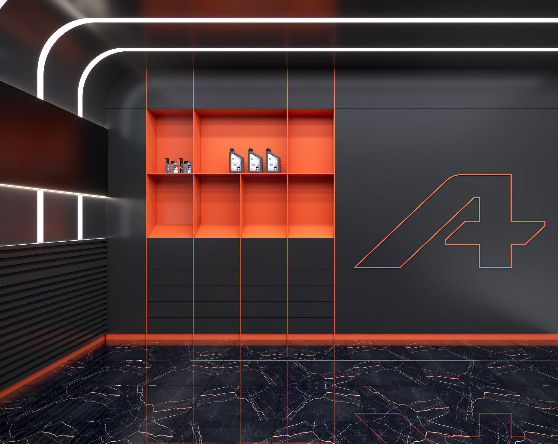
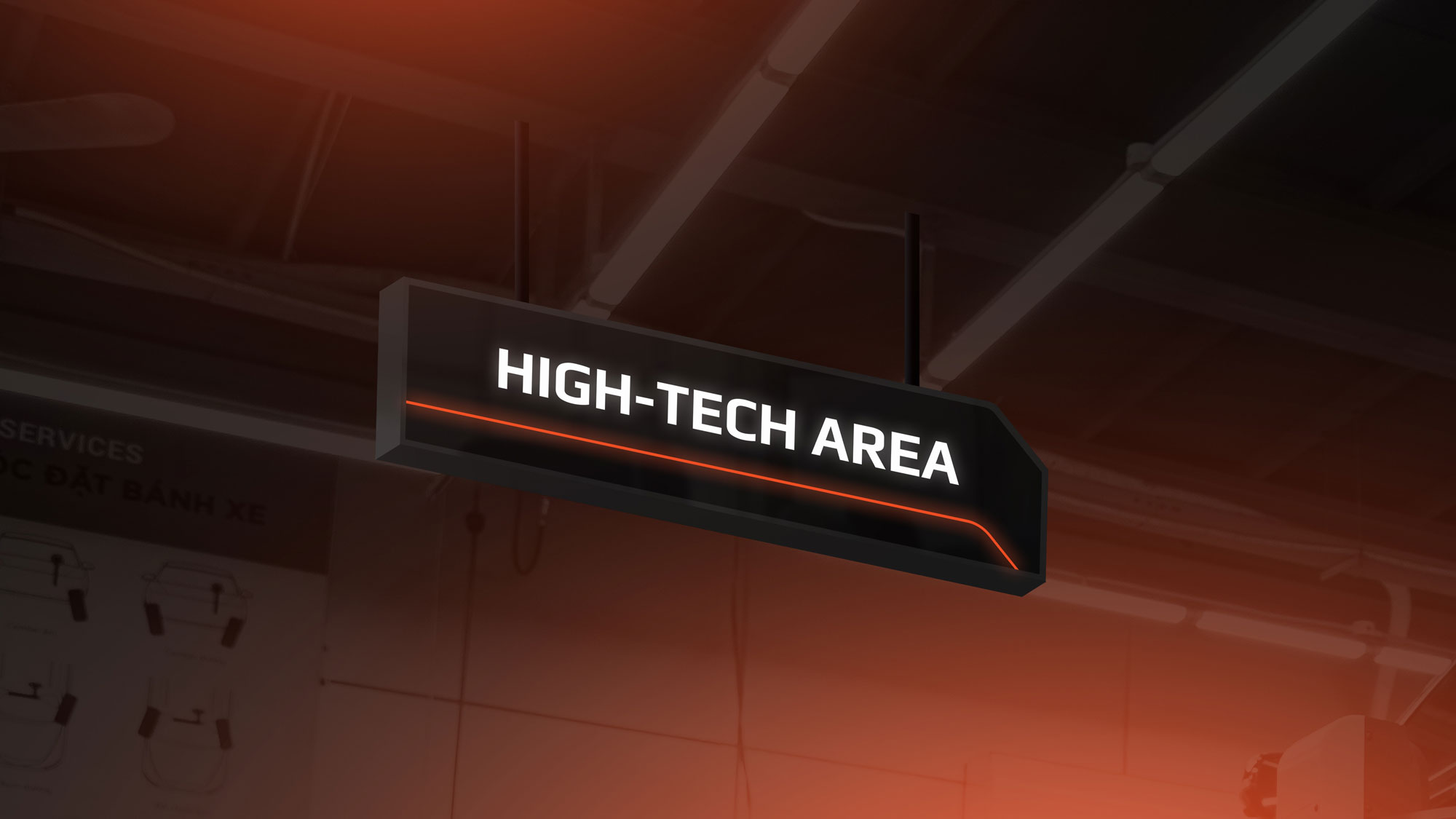
Showroom Design
ATOM was formerly a company with nearly 30 years of experience in the tire industry and a strategic partner of numerous tire brands such as Bridgestone, Yokohama, and Michelin. when ATOM first launched 5 years ago, the company made a breakthrough by building a ONE-STOP SHOP model, providing a full range of high-class services for cars, such as Tire and batteries supply – Repair and maintenance – Beauty and car care – Accessories and toys - Car tuning.
With its innovative model, ATOM has been a pioneer in Vietnam. With Service Quality as the core of the business, after 5 years, ATOM has reaffirmed its leading position in the high-end segment. That affirmation is expressed more clearly through the project of Relaunch ATOM’s new brand identity as well as its positioning "PREMIUM AUTO SERVICES". And we are honored to be ATOM’s trusted partner in this project.
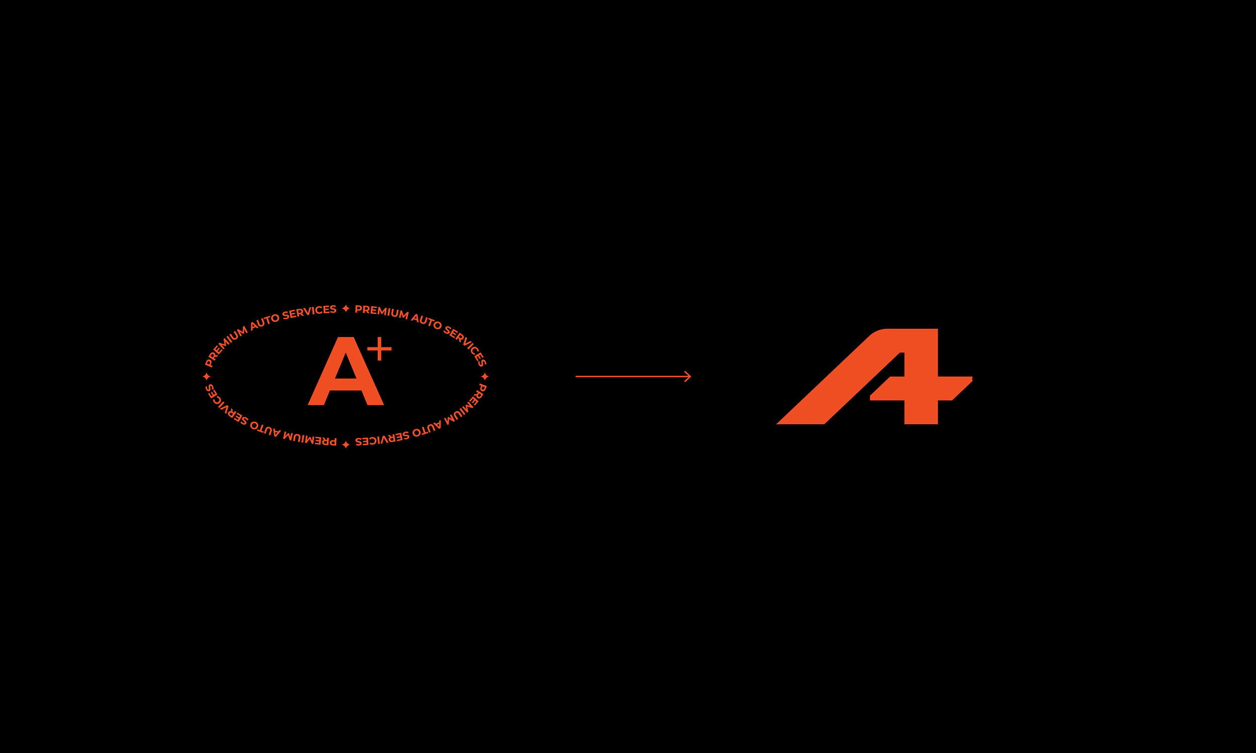
"What's Premium?"
Premium is an abstract concept. A variety of approaches were proposed during the ideation process. With a "Customer-centric" mindset, we believe that every solution should be presented from the perspective of the Customer towards the Brand.
We look for a metaphor, an expression that already existed in daily life to make the concept of “Premium” more comprehensible. We often hear of “Grade A star”, “Grade A quality”, and “A score”, … These phrases have one thing in common: they all describe The Best in Class. If A is The Best in Class, then A+ must be the Best of the Best. More importantly, A is the first letter of ATOM, making it inevitably the brand’s symbol.
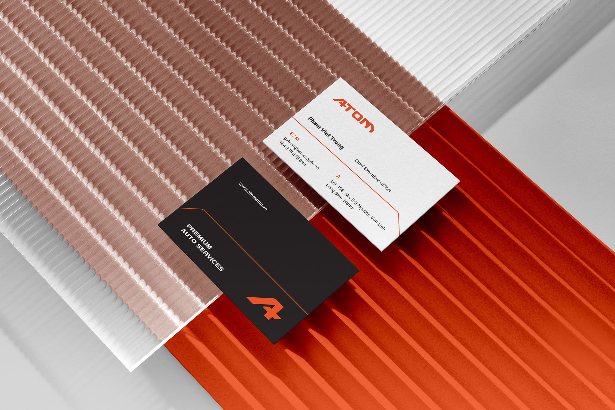
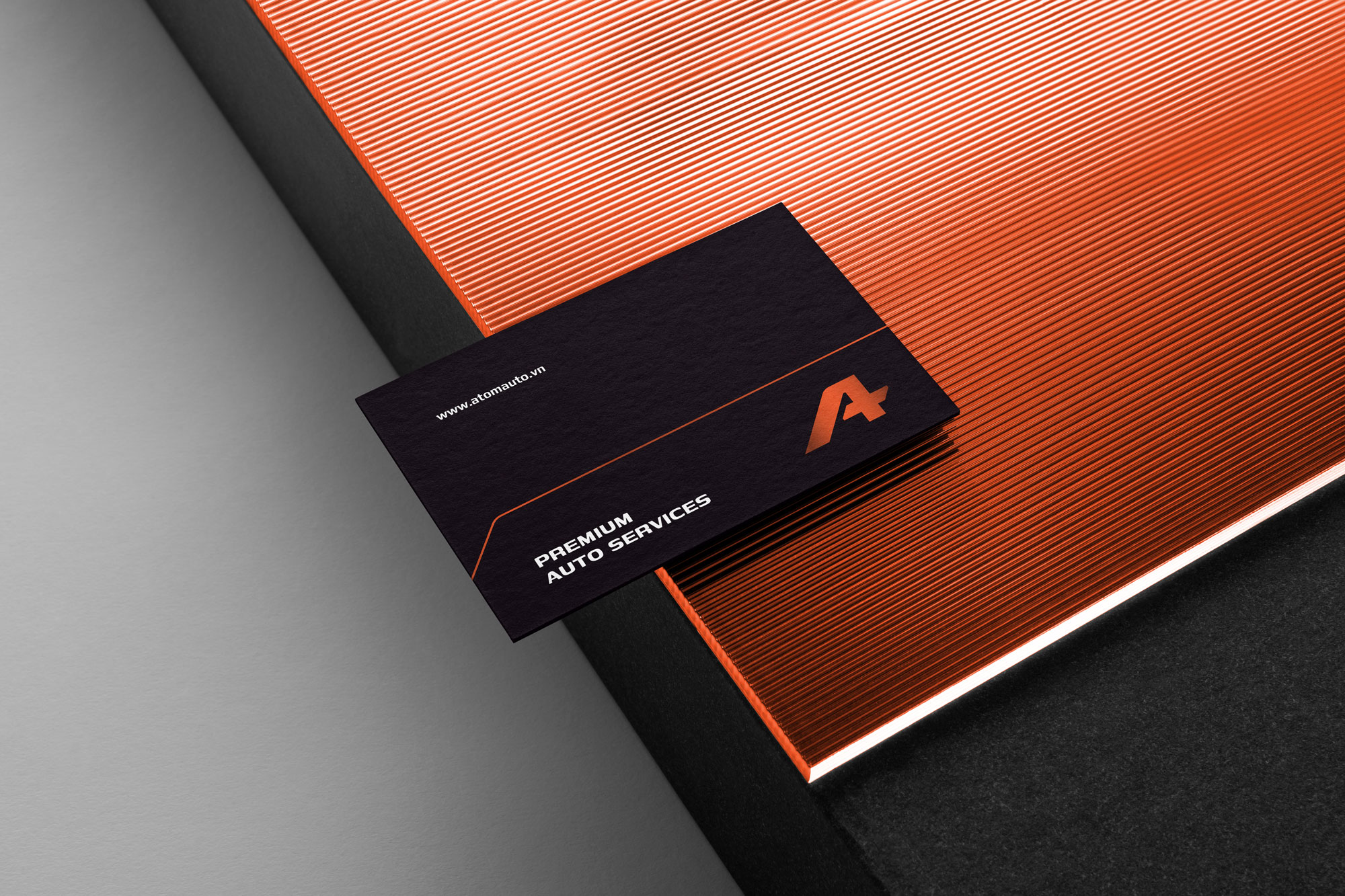
That’s why “A+” is our Brand Concept, which represents ATOM’s positioning as “Premium Auto Services”
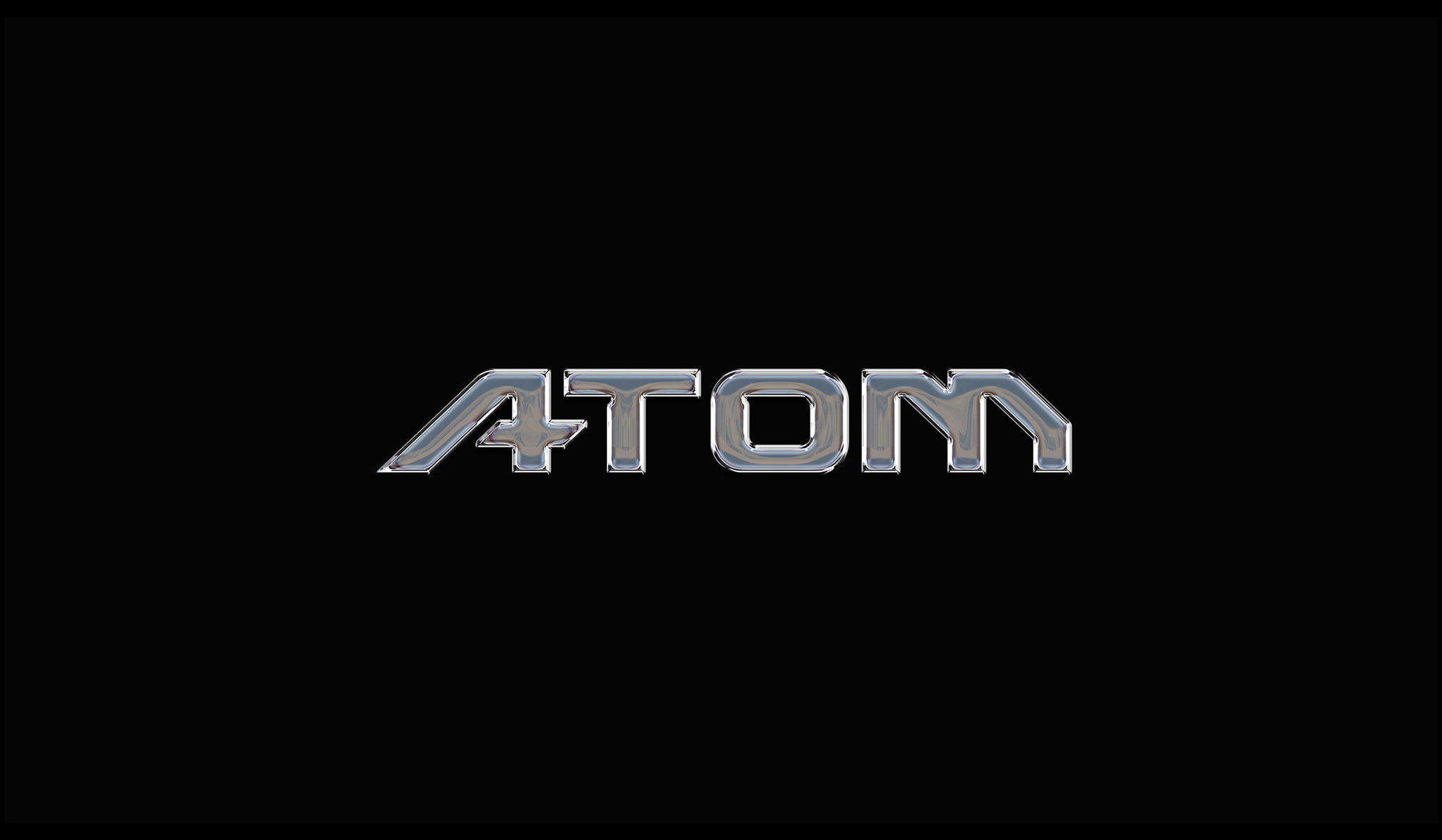
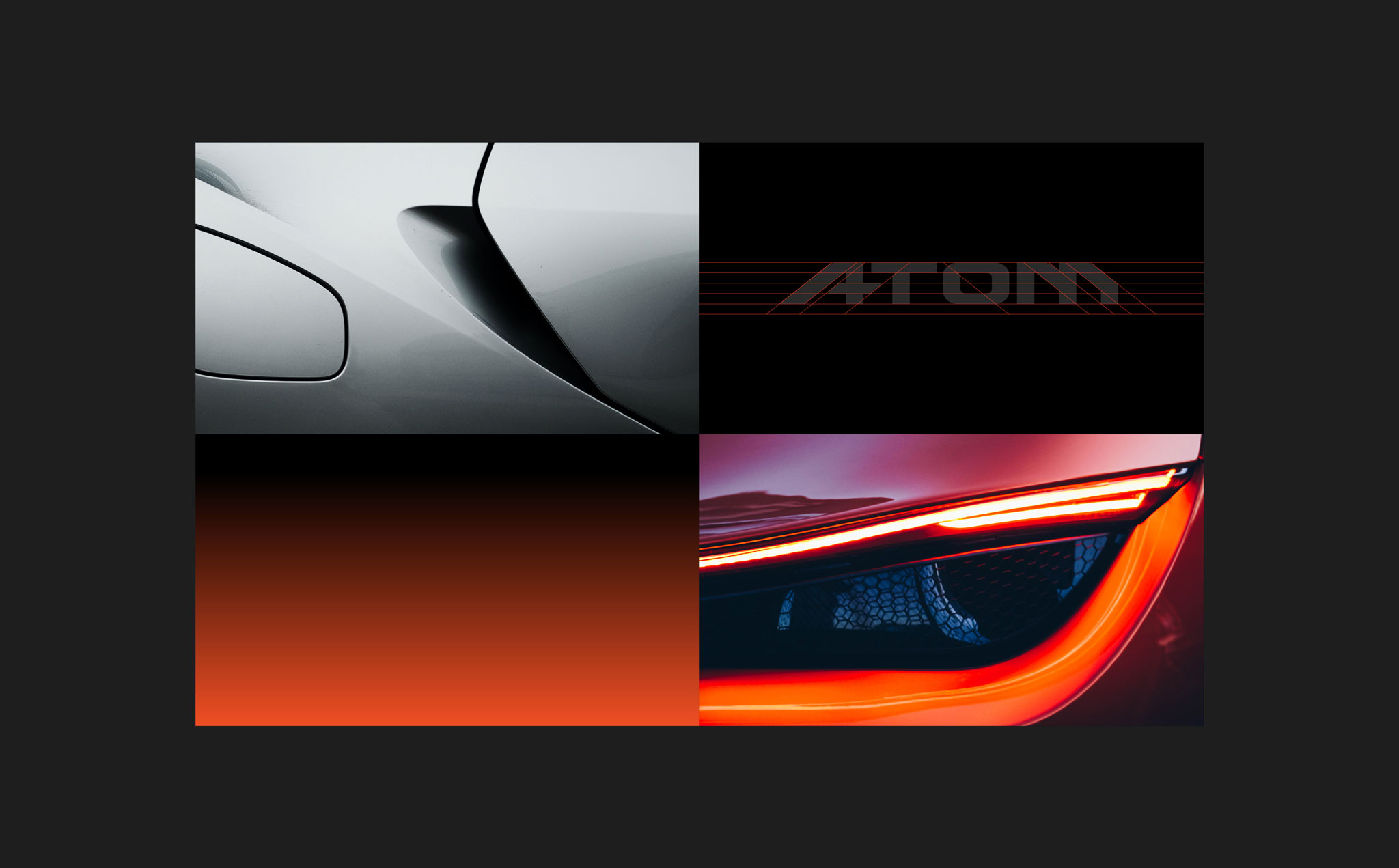
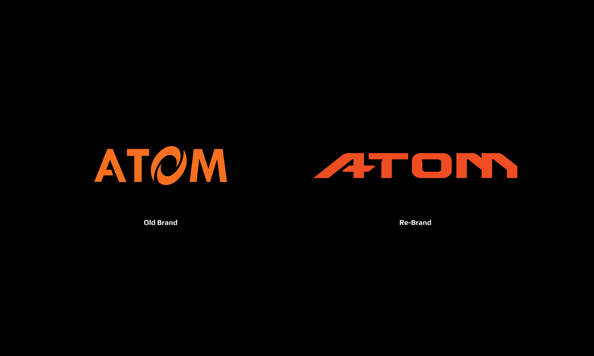
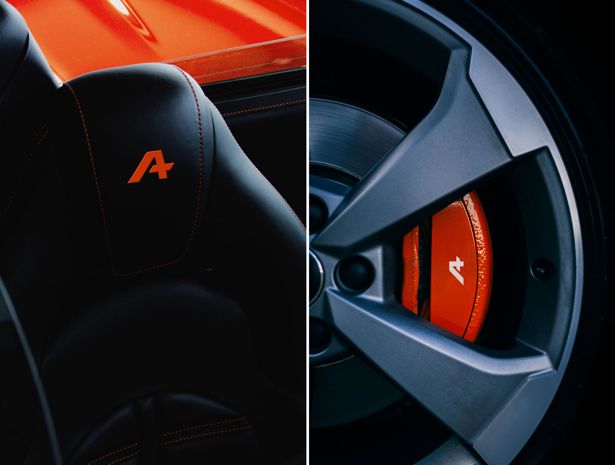
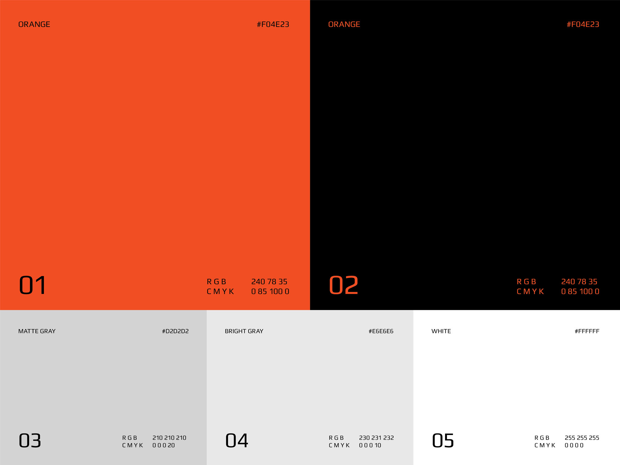
ATOM Logo was developed from the initial letter "A" inspired by "A+". We had the Brand’s Orange color slightly adjusted and recommended the use of Black background instead of white to increase the sense of PREMIUM. The Orange line is used as the key brand element to create consistency in ATOM’s brand identity. With the vision of the becoming leading brand in the Auto Services industry, we make sure ATOM’s brand identity is flexible and compatible with every touchpoint of the Brand.