
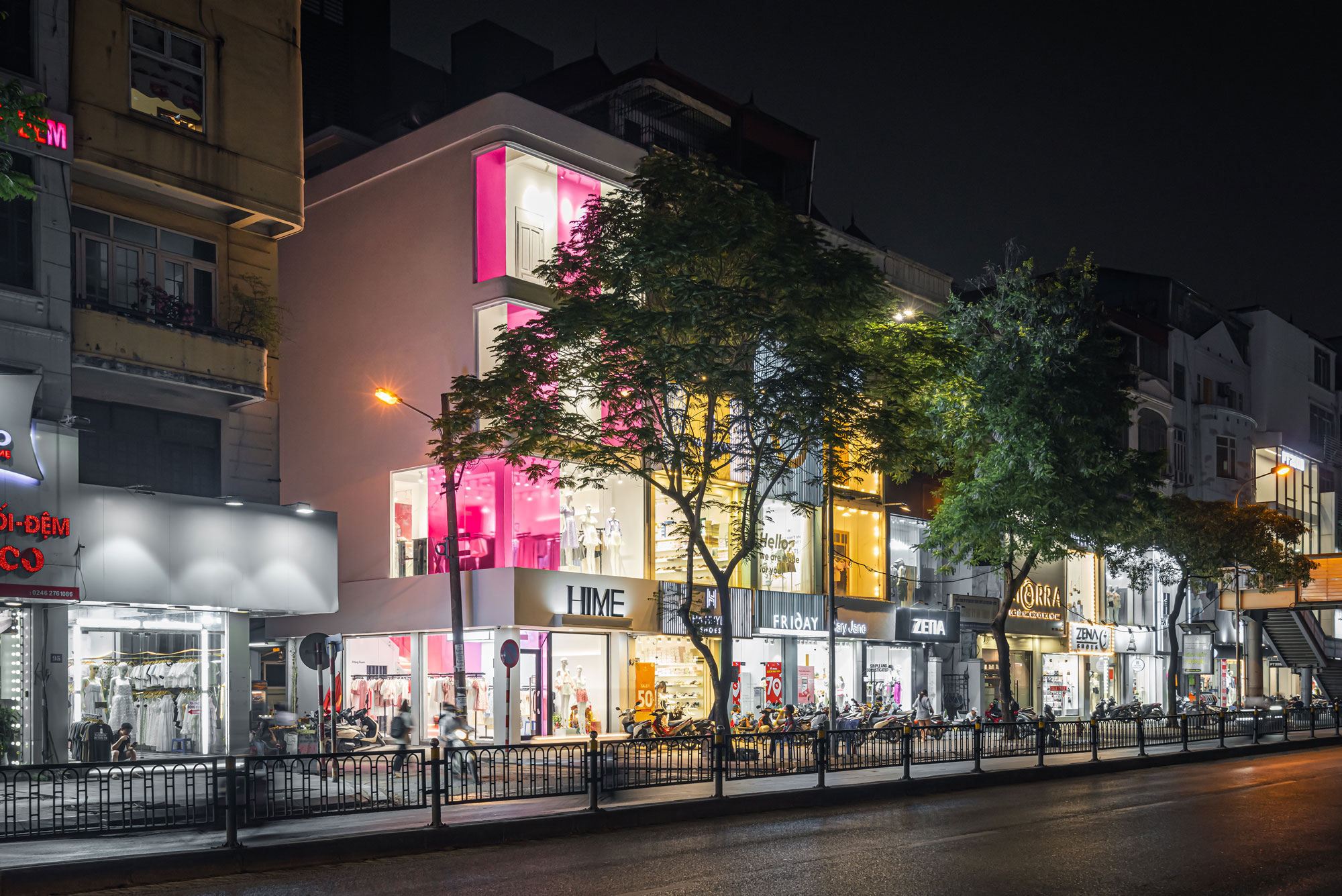
Hime
Using Color as a highlight of brand space
Store Concept
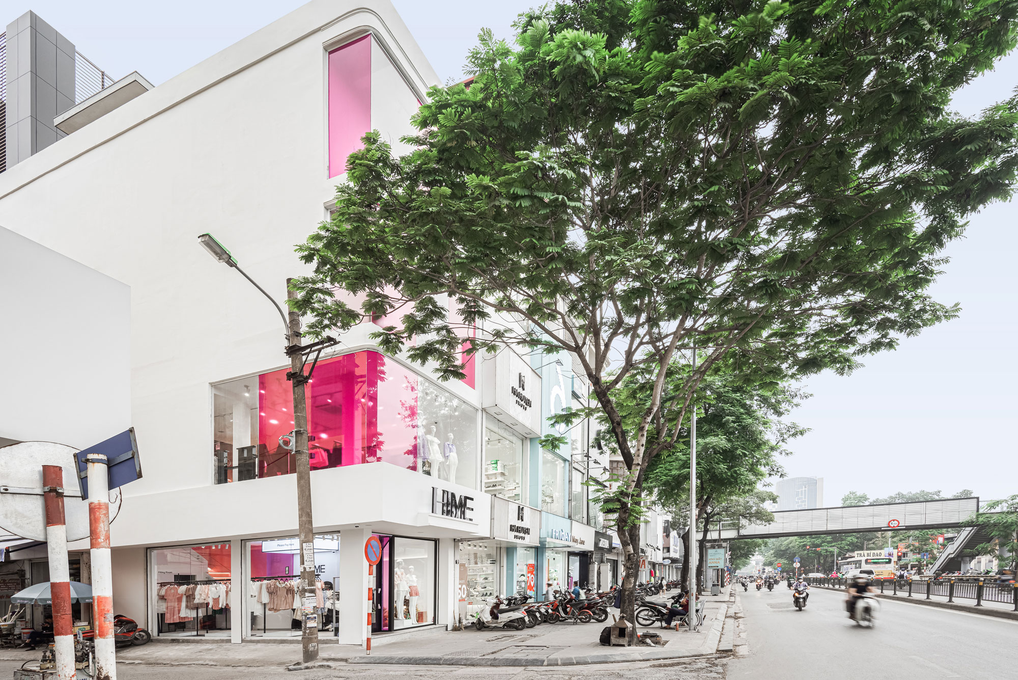
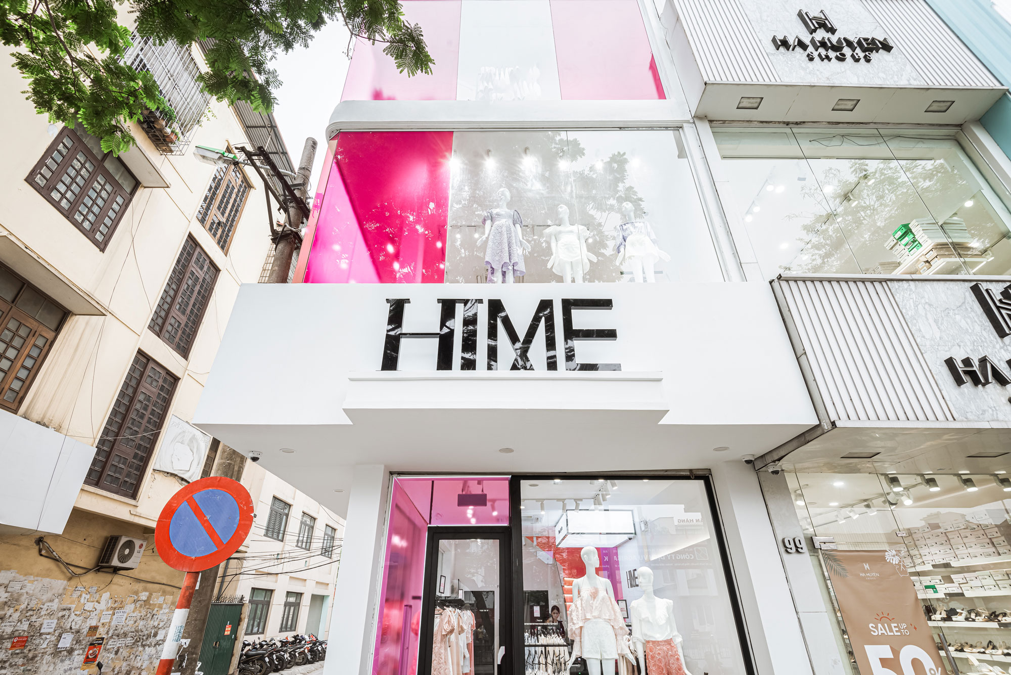
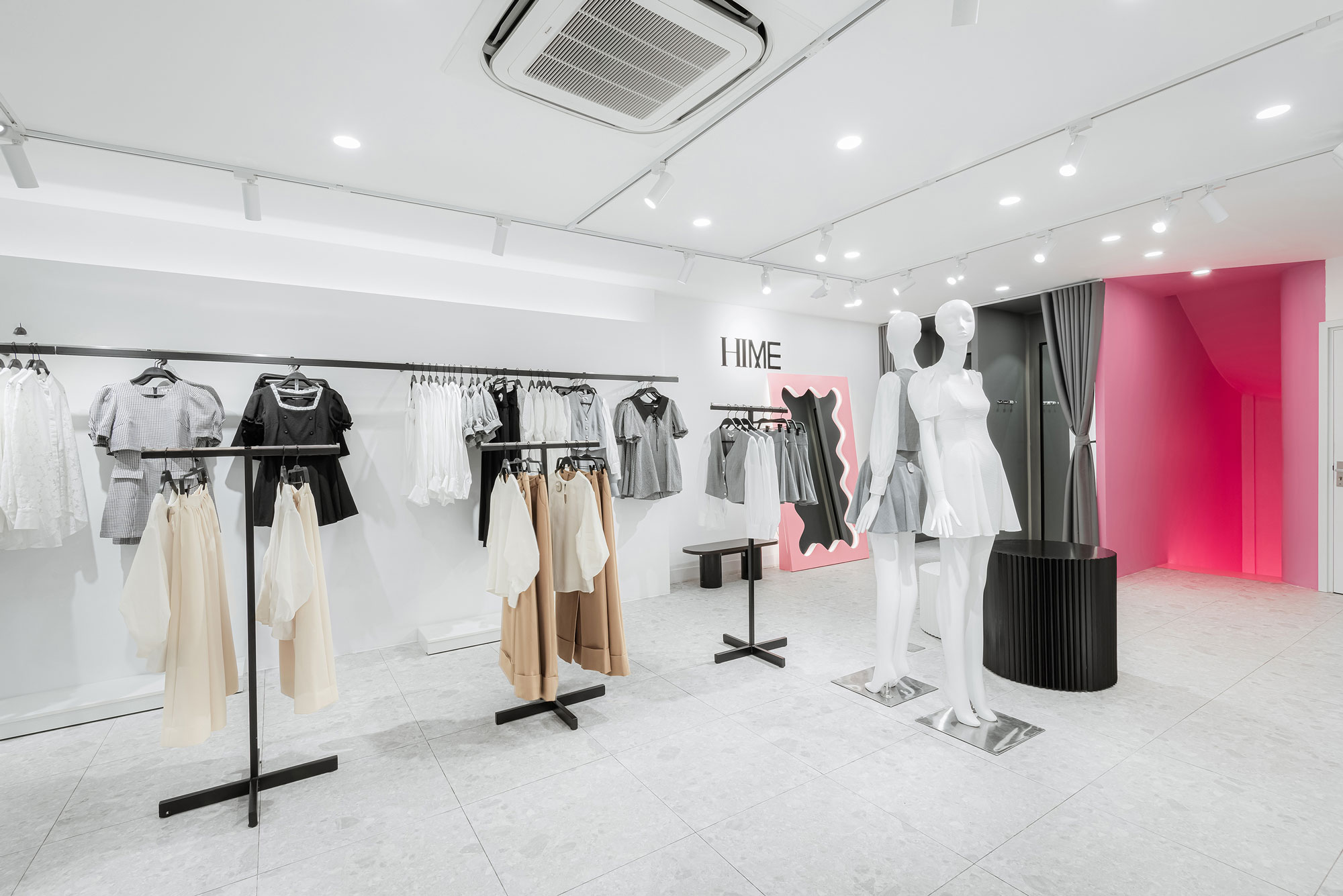
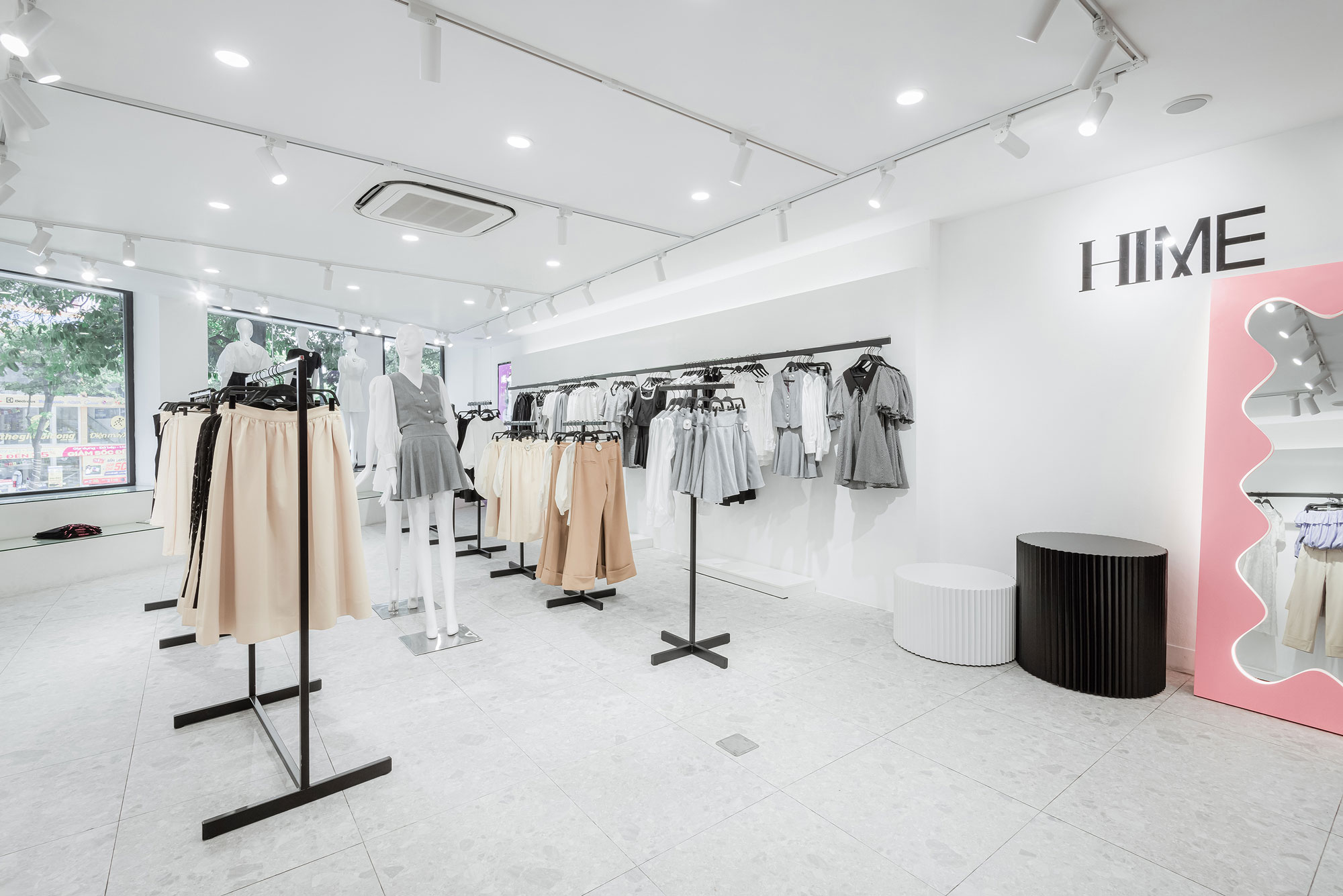
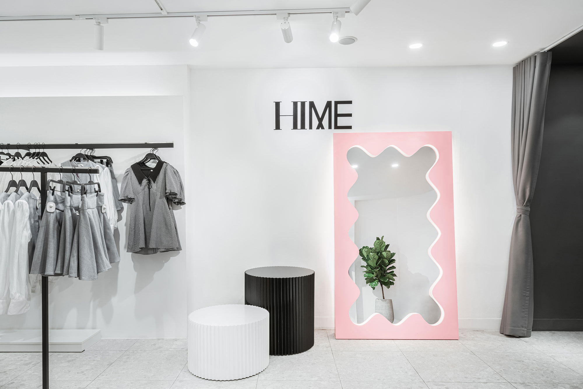
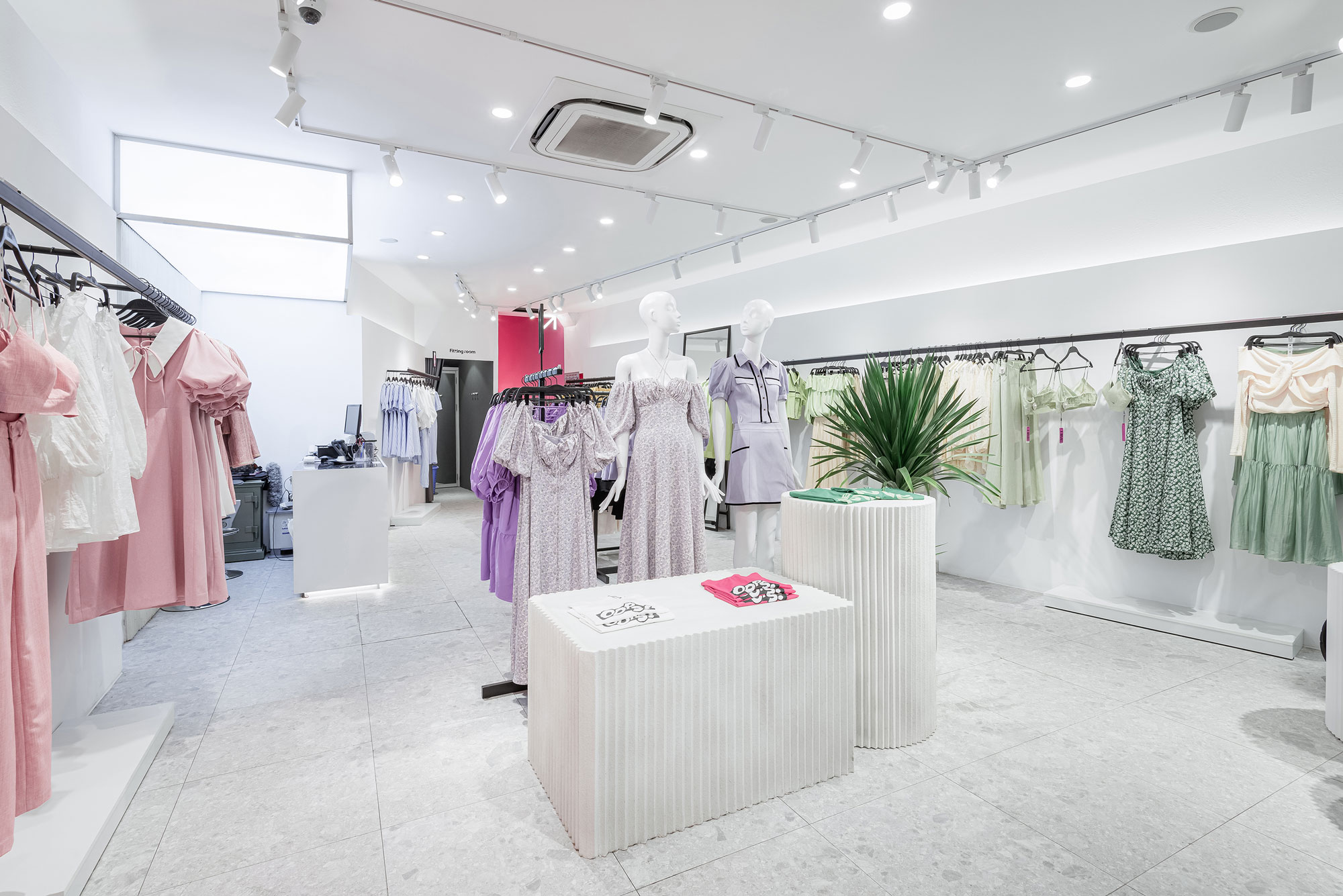
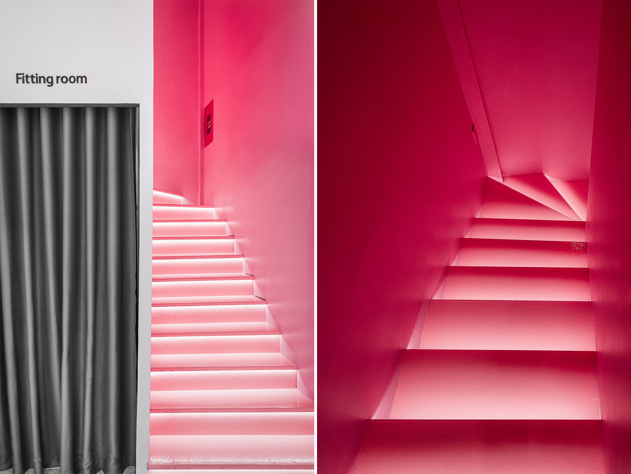
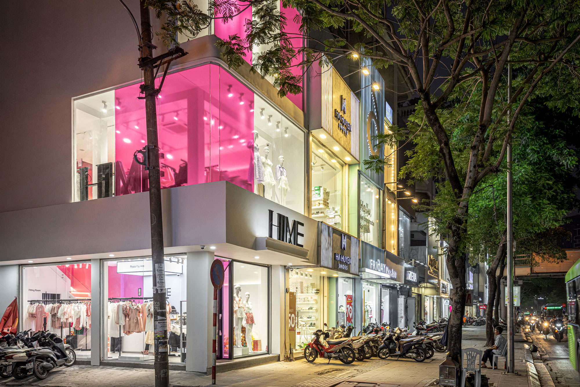
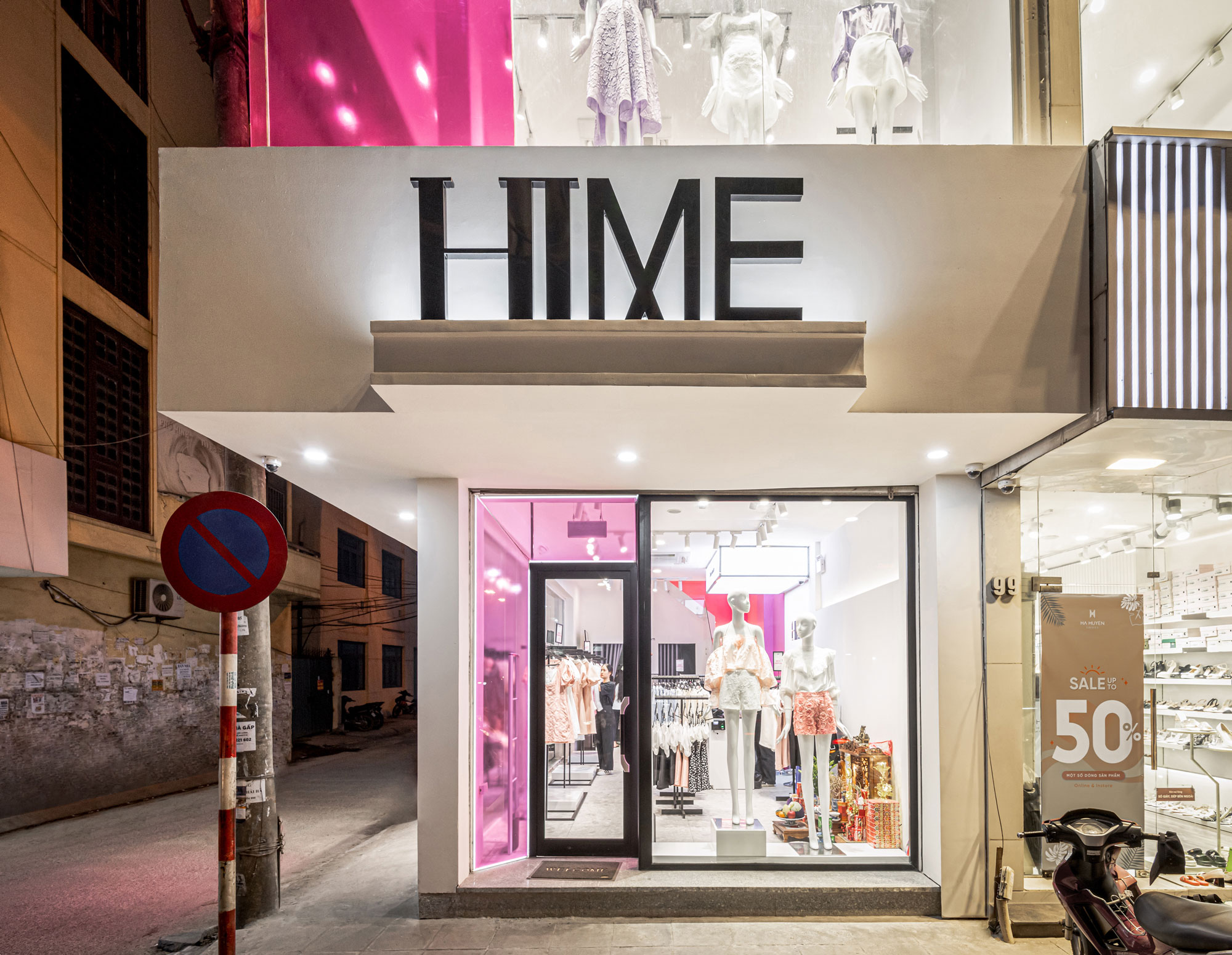
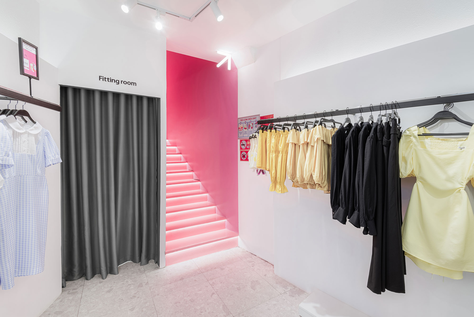
Store Concept is the following project of Brand Identity Design project for Hime. Following the consistent Brand story about Opposition, we create our own design language by selectively using Pink on multi-materials that match the surroundings to engrave one message in the mind of our customers: “Hime is Pink” and vice versa.
HIME Store will always be the highlight at every place where the Brand appears. With the naked eye, viewers can also easily recognize the differences compared to the other brands. It is the result of bringing Color to the daily life of the Brand in a striking and natural way.
